An invitation to occupy and the twelve obsessions
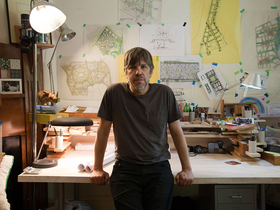
Meet Bob Earl of Oculus, a think tank/urban design/landscape architecture studio/lots of other things. In addition to all these hats Bob is a self-confessed chocolate slut from Queens. Over three kinds of chocolate bars we talked about the creation of Hotel Hotel and its surrounds.
For most developments, landscape architecture usually ends up being the add-on at the end, as a garnish for the main course, which is the building itself. Not so for Nishi, Hotel Hotel’s home. Bob is the guy that has been there from the very beginning, he has shaped the way that the building looks, inside and out, how it feels and what it communicates.
Bob’s job hasn’t been to pretty up the exteriors with whatever plants are hot right now (nien, spit, nien) but to create a sense of domesticity, of beautiful every day, of intimacy, of coming somewhere for the first time but feeling at home.
The overall statement of the project has been an invitation to occupy the space.
The process is infinitely more interesting than a description of the end product itself (you’ll just have to come and take a look to know what its really like.. Stay a while… Be part of the landscape). To understand the process you need to know about what Bob calls ‘The Twelve Obsessions’, the quiet and ever changing non-manifesto that Oculus works by.
The designs for Hotel Hotel and Nishi have changed countless times but have always had these obsessions in mind. As Bob poetically puts it, “seeds have been sown by countless people, only to germinate months later, and lead us on a new direction. So much so that there is an authorless quality to the project”. The plans have changed just as many times, and to be honest, “I’m not sure what anything is anymore, but it’s good”.
The Twelve Obsessions
Messy is good
This is pretty self-explanatory. In Hotel Hotel’s case the mantra was ‘let the plants attack the cracks’ and ‘let the landscape invade the building’. Think post-apocalyptic urban jungle. Like that scene in the 13 Monkeys where Brad Pitt stumbles out into the light to a building overtaken by vegetation.
Obsession with the fence and privacy
This is challenging the very Australian practice of marking out territory as being either private or public. Isn’t it more interesting to make a mark in a public space? Like setting up a couch on the sidewalk to sit and have a beer and a chat. In the Hotel Hotel scenario, it’s about voyeurism… When you stay in a hotel you want to see other human beings. This has been channelled by the three level atrium that 26 of the 68 hotel rooms look onto. The atrium is predominantly populated with Tasmanian Tree Ferns (Dicksonia Antarctica) creating a screen that allows glimpses of shadows and human activity, like a puppet show.
Public space is public experience
This is about setting the stage for the theatre of life. This happens in very subtle ways: providing steps to sit on and shade to sit under, having different kinds of seating so that people can do different things. This has happened all throughout Hotel Hotel and the NewActon precinct generally. The end result makes for good people watching. This obsession is never really complete, and always needs to be added to.
The need for friction
This is about getting lots of and all different types of people to share a space. Chances of a punch up increase exponentially but ideas and ways of doing things will be challenged, which can only be a good and interesting thing.
Dominance of the politically correct
This is probably the most challenging and frustrating obsession. The absurdity of certain laws and design codes that stop some bloody brilliant ideas dead in their tracks, or homogenise them to the point of not being worth doing at all, and leads to a sterile public space. This also relates to how we as space users adhere to public space regulations and what is commonly considered socially acceptable behaviour. We’re not saying you should start littering or anything, but maybe bust out a tune next time you’re on a park bench.
Cake decorating
No, no, no. Just no. Landscape architecture is about domesticating a space, making it feel intimate and inviting; not putting flowers in planter boxes.
Boldness and beauty
Create a space that inspires, that elicits belonging, that expresses civic beauty. Be brave and express how you feel, chances are the rest of us feel the same way.
The need to be with others but still be alone
Create a space that encourages a smile, a public kiss, flirtation, a casual conversation. There is at the same time a comfort and a sexiness to being alone amongst a mass of people, engaging if you want to, or just watching.
Spontaneous combustion of public energy
Bob talks about a tendency these days for curated spontaneity, like flash mobs, which are great but lack the depth of the real thing. He told me a story about coming across an old couple in the park in New York dancing to the music of a nearby carousel. It’s tricky getting the formula that allows for this in each space, but if you get it rights its pretty darn nice.
You can’t engineer use
One of Bob’s favourite things in a project is going back to see how people interact with a space. Mostly it’s not how you would expect. So the key here is not for grand gestures, but rather subtle and vague details that are open to interpretation and use.
Combined intellect
Don’t pigeon hole or label expertise but instead bring in a whole range of thinkers to influence and shape a space. Why not collaborate with a barista and an octogenarian on making a bus stop? The end result will at best be genius and at worst be outside of the norm.
Celebration of the everyday
Look at the things that people do in their every day, drinking a coffee, walking to work, buying the paper, and make that experience better. These experiences make up 90% of our life experiences, make each one special.


