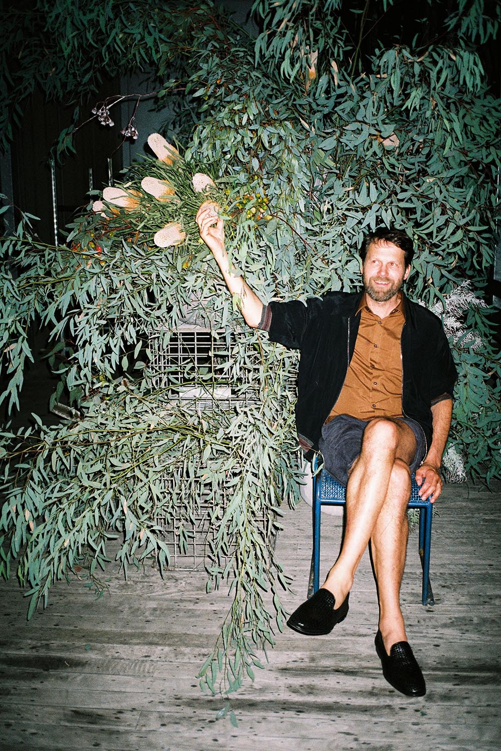
Martino Gamper shot by Will Neill of U-P
Gamper
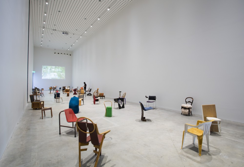
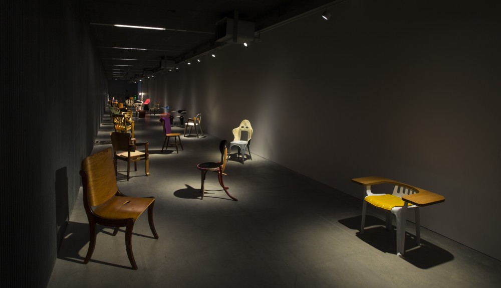
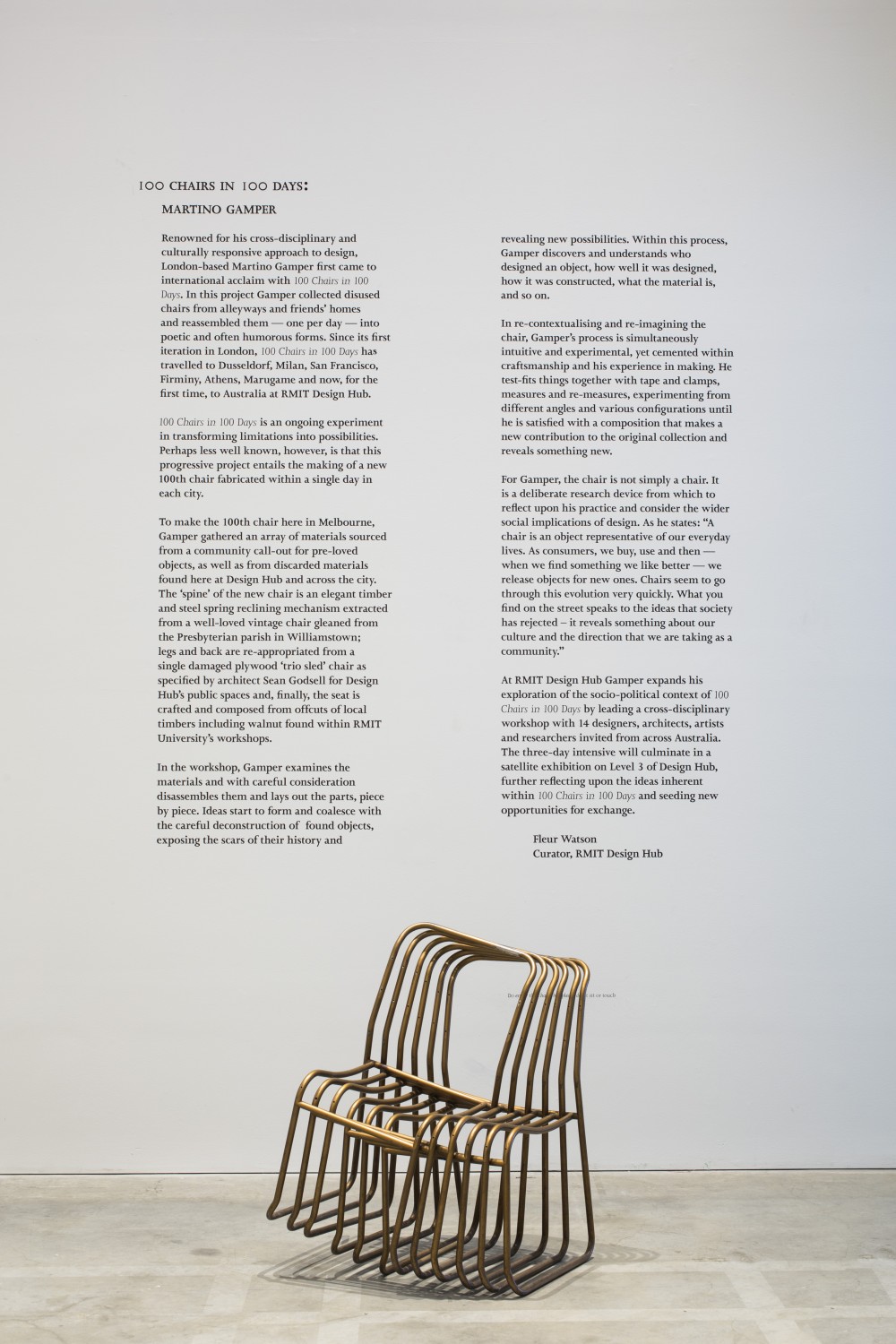
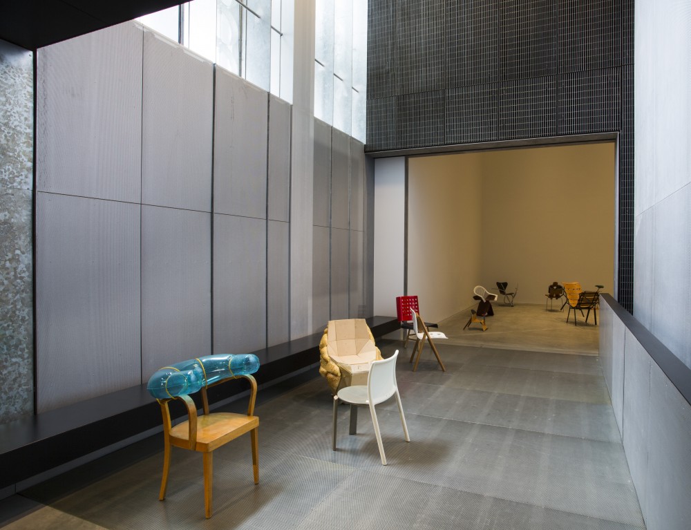
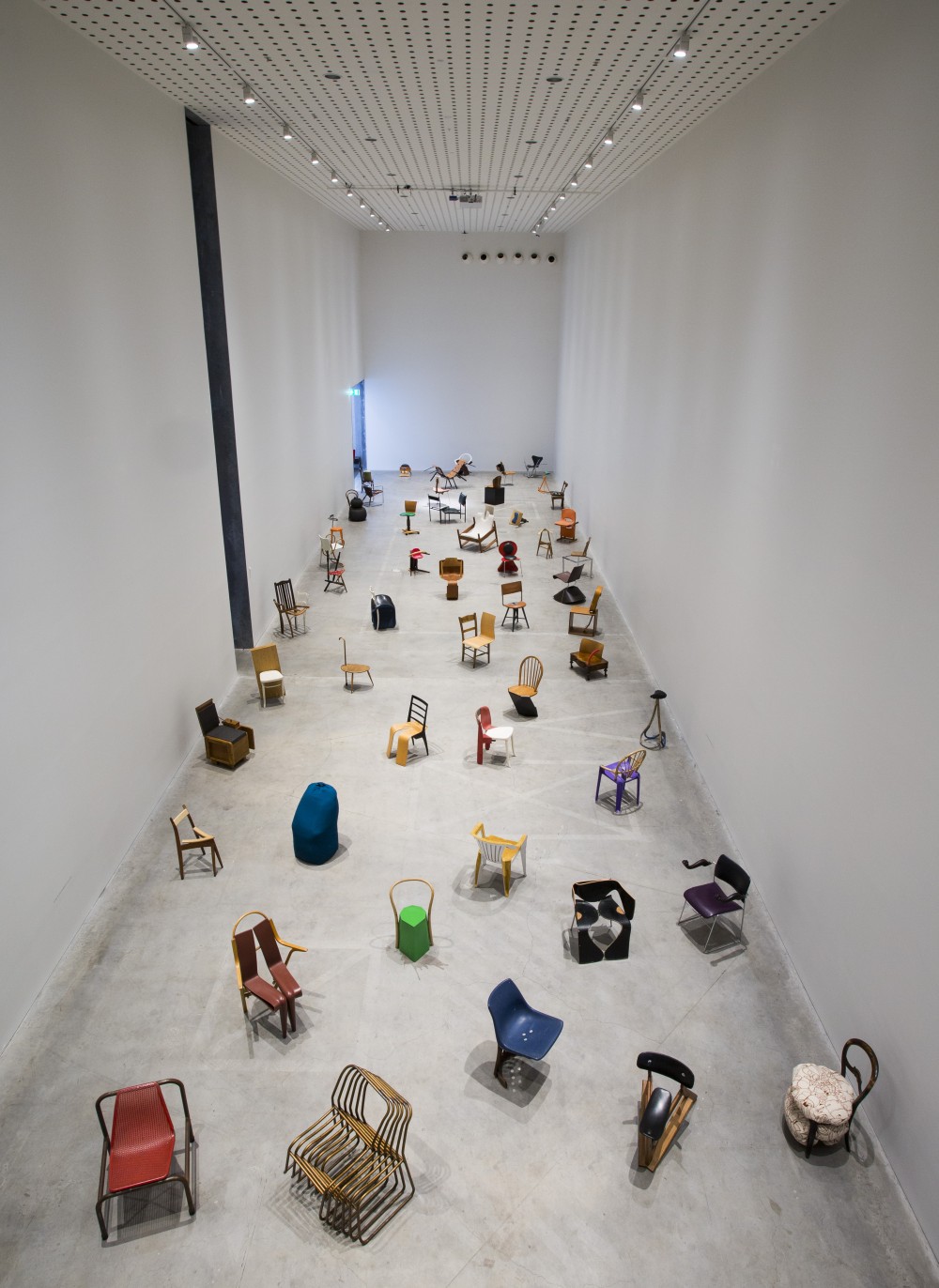
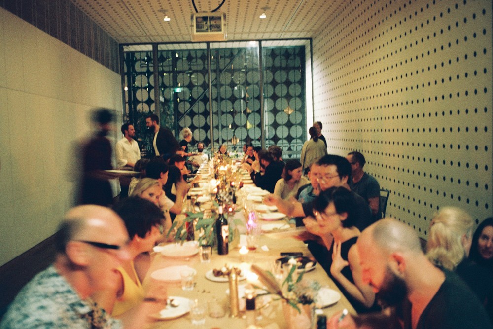
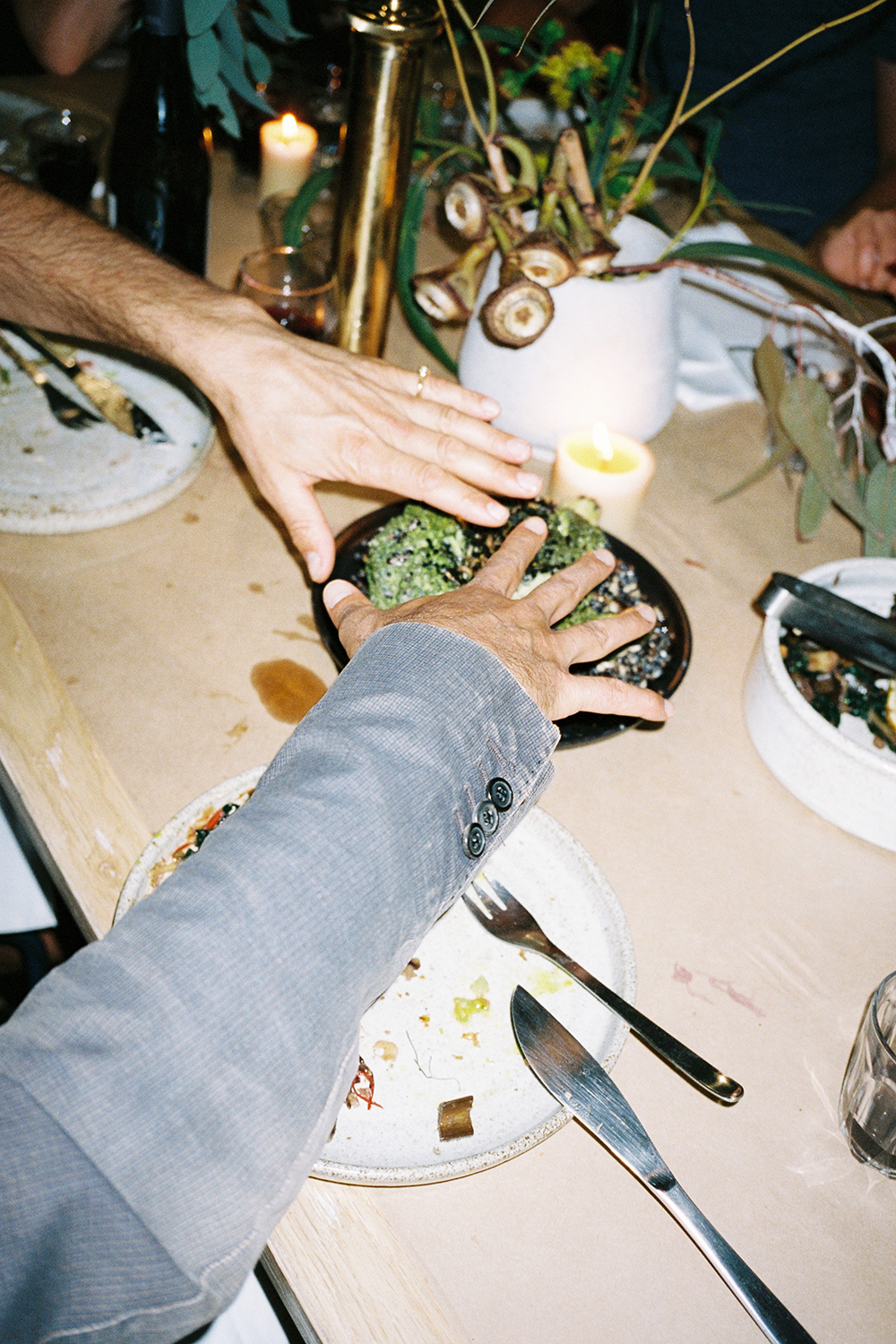
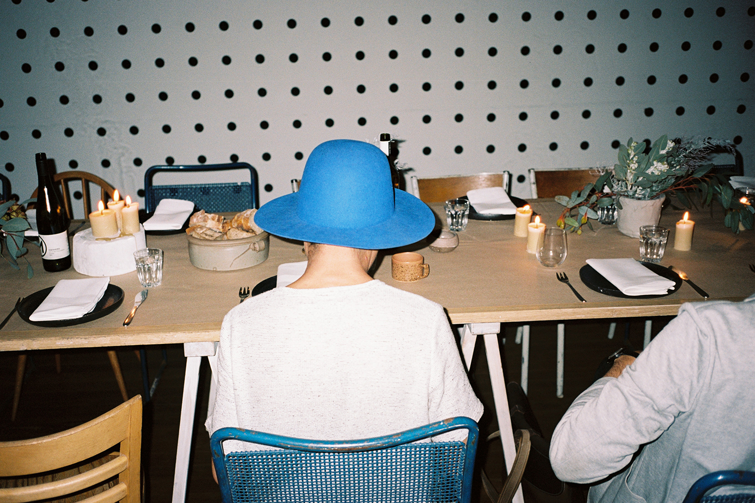
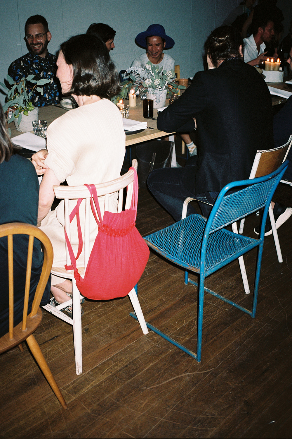
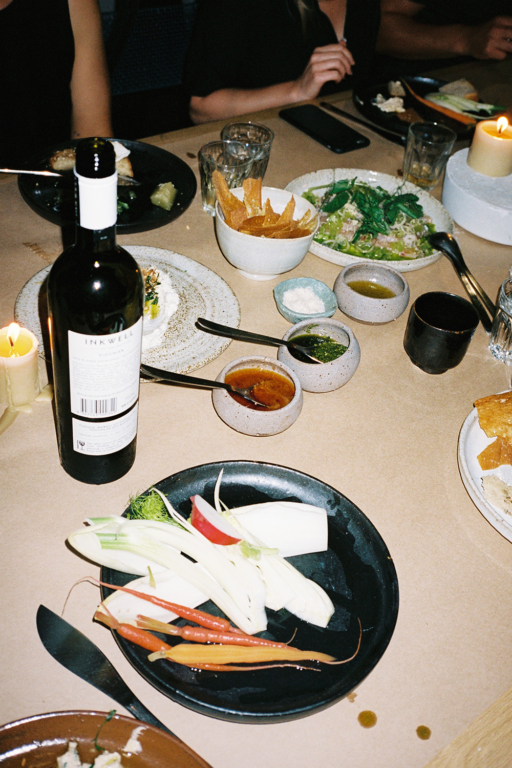
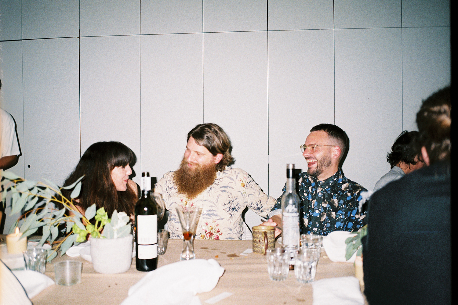
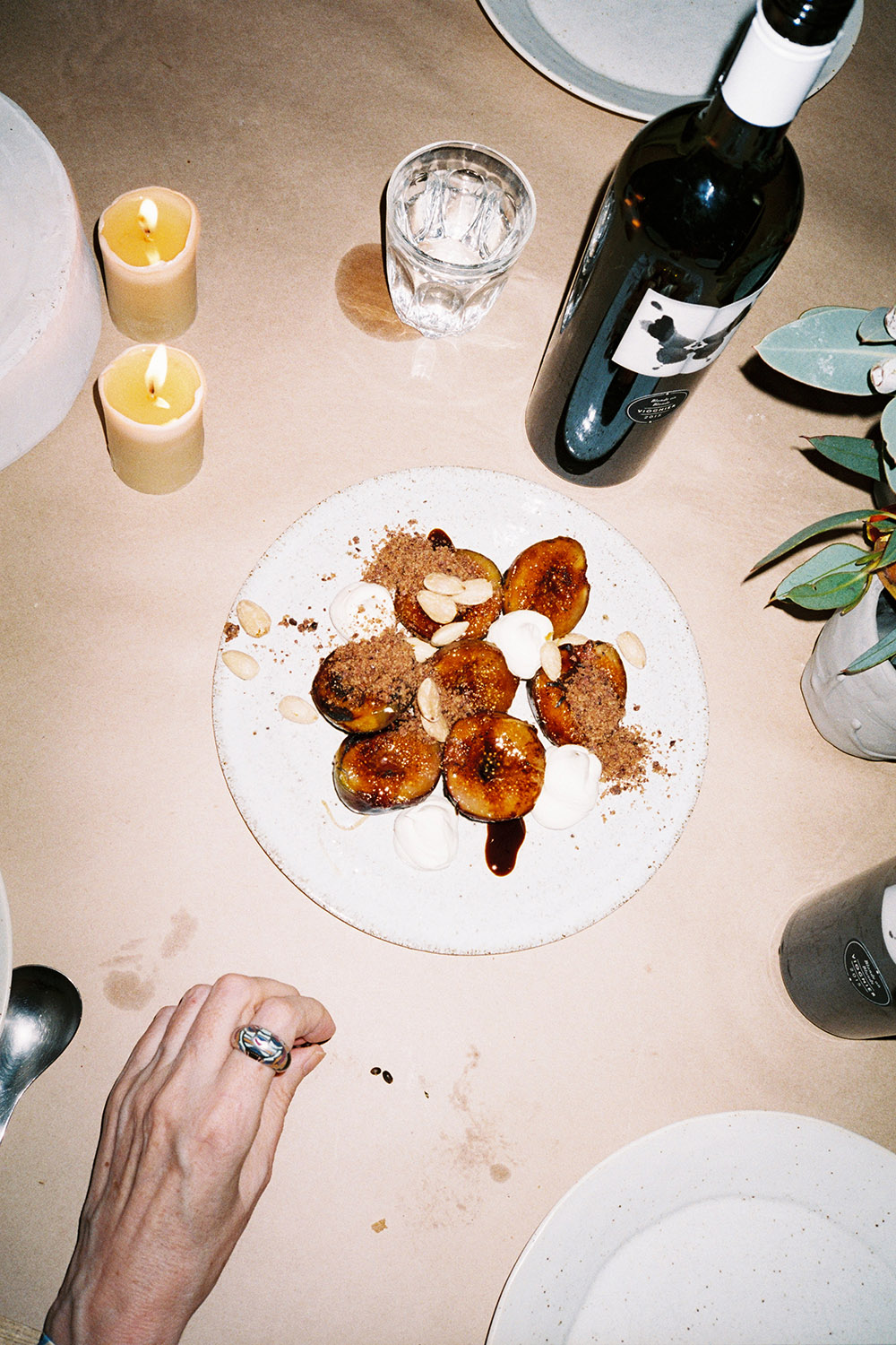
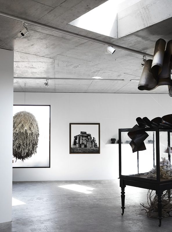
Martino Gamper‘s ‘100 Chairs in 100 Days’ exhibition at RMIT Design Hub in Melbourne is finishing soon. You should go and see it while you can. We went as soon as it opened. We were excited. We held a dinner for Gamper with Design Hub on their roof. We invited new and old friends. Monster kitchen and bar cooked. Cecilia Fox did the flowers. Valerie Restarick lent us some plates. Nur Shkembi and Jad Choucair read us poetry. It was excellent.
The curator of Design Hub, Fleur Watson, interviewed Martino Gamper and together they reflected on the impact of ‘100 Chairs in 100 Days’ on Martino’s expanding practice.
(Fleur)
‘100 Chairs in 100 Days’ is a long-term project — initially launched in 2007. Now nearly ten years on, what do you think you have learnt from the project and how has it continued to impact upon your ongoing practice?
(Martino)
Looking back, I can see that the project has taught me that research is a very important part of a practice. The project was not commissioned in any formal way and there was no direct reason or client involved. It was driven by a very simple idea that was self-initiated and by instinct. The project highlighted the importance of carving out the time and space to continue to research.
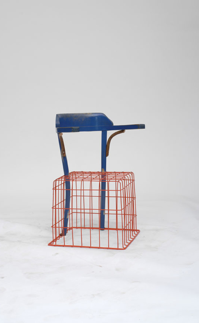
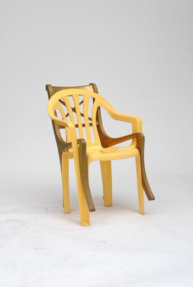
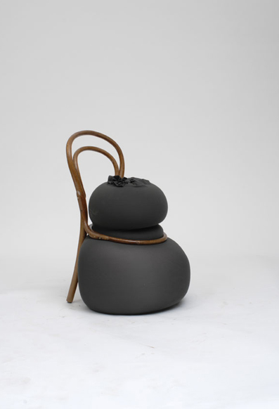
By focusing on a singular element — a chair — and spending focused time on the project — 100 days — I learnt so much. Now, almost ten years later, these are ideas that my practice still draws upon — ergonomics, materials, mixing styles, improvisation — so the impact is still quite big.
The impact of this project was also external — it put me on the design map and communicated to the outside world a process and approach to design that was something quite different than what was being shown in design shows and magazines at the time.
In the book that accompanies the exhibition — ‘100 Chairs in 100 Days and its 100 Ways’ — there’s a short essay by Deyan Sudjic that describes the chair as having taken on an authority of its own, as distinct from the people who sit in it. There are seats of power, there are chairpersons, there are tenured chairs, hot seats and so on. Was choosing the chair as a typology a deliberate move, or could it have been another singular object?
Yes it was deliberate. A chair is an object in our everyday lives. It holds our weight and responds to our bodies. Over time, it can become symbolic of who we are — almost as a reflection of ourselves, our style, age and preferences. Chairs reveal our intentions and anticipate what is going to happen in the space through the way we arrange and use them as functional props for our behaviour. Chairs support the functions of the everyday — we read, watch, eat, sleep in them. Yet you can also find chairs discarded on the street even when they are not useless. When I looked around, I realised chairs were the most prominent thrown away objects. As consumers, we buy, use and then — when we find something we like better — we release them for a new thing. Chairs seem to go through this evolution very quickly. What you find on the street speaks to the ideas that society has rejected — it reveals something about our culture and the direction that we are taking as a community. Chairs are a pretty good example of us, wherever we live in the world — they leave a trace, they have a layout, they leave a good picture about what has happened.
The notion of ‘making’ is very much part of your process but equally the process of unmaking — taking a piece apart and understanding the way it has been considered and composed by understanding its scars. How important is this process of ‘unmaking’ to your practice?
Yes, I think the unmaking is an important part of the process. Firstly, finding a chair on the street and choosing whether or not you pick it up. That is where my imagination starts… what is the potential for this object I have found? Then in the studio, when I’ve brought all these chairs into the space, I deconstruct them, discovering and understanding who designed the object, how well it was designed, how it was constructed, what the material is and so on.
You also discover how people fix things over the years by adding screws or string or other materials to find ways of modifying the object. By taking away the layers you can see the construction of the chair underneath. So much of the design is in the underbelly of a chair — how the connections and fixings are made in a very particular way. In some cases it is thinking about how the workers in a factory would have put the components together and how elaborate that process was — it’s studying the morphology of the chair.
In the unmaking or taking apart, I also find a way to deal with parts rather than the whole chair, which, in turn, makes a more interesting starting point. It is much easier for me to imagine elements rather than dealing with a single object of a whole chair.
In such instances I cut the chairs. For example with the Jasper Morrison ‘Air Chair’, I cut through the cross-section of the chair to see what was inside. It’s made of a plastic — polypropylene — through a gas-injected process. What’s interesting to understand is what you don’t see — the inside — what’s created through this process. And then, compare that to the Ikea copy of the Morrison chair. What are the differences in process and result? So, yes, you can see that the process of taking the chairs apart is as important as the start of the process of making the new chair — it creates a clean slate, or a tabula rasa.
‘Making’ in a contemporary context is now something often associated with the ‘democracy’ prescribed to new technologies — 3D printers, co-design and ‘maker spaces’ etc. What relationship — if any — do you feel your work has within this context?
I think every new process that becomes more readily available creates an opportunity for a new perspective on design and making. However, I do think it is important that the idea is not generated just for the sake of using modern technologies.
For example, twenty years ago when desktop publishing software first became available, everyone was suddenly a graphic designer. From the first moment of working with Photoshop everyone was using all the filters. It was just about playing with the effects rather than really investigating what Photoshop could actually do to support design ideas. I think we can see some of the same kind of issues in the early days of 3D printing. But the interesting thing is when we can really use the tool in combination with other processes and contexts.
For me new technology becomes very interesting when combined with conventional technologies. Today when we went to the Design Hub workshop and saw the work being made using a robot and a bandsaw, I was thinking: “Why is the bandsaw there?” Because, by itself, the bandsaw is pretty stupid – it does one thing very well; a bit like Photoshop in a way. And, to a degree, the same can be true of the robot. When it becomes a tool combined with other tools and even within a matrix of tools, that’s when it becomes exciting. When you mix the digital with the handmade, they work together and yet question each other so you can really learn from the process.
A key aspect of the ‘100 Chairs’ project is that you make a new 100th chair (within the constraint of a single day) for every iteration of the exhibition, and on location in that particular city as the show travels. How might the 100th chair you produced in Marugame, Japan be different than the one you might make in Melbourne, Australia for example? How do you draw these cultural differences out in the chairs through the composition and materials?
When I meet the chairs again within a new city and context, I feel a bit like the ‘father figure’ of the chairs in a way. When they go back into their crates and move on I kind of forget about them and then when they emerge again, I really look at them and reconnect. Every time is different.
Seeing the architecture of each city and the context that the chairs will be displayed within has an affect on the making of the 100th chair. The space the chairs will occupy — the lighting, textures, the floor — all influence the process of making. Each of the 100th chairs recalls a particular place — the source of the materials, taking things apart, putting them together, placing them in the context of the other chairs. Each chair is a synthesis of the travelling, the making and the conversations that I had in that place.
In a recent article for ‘Mono. Kultur‘ you describe the importance of design curation as being contextual rather than simply a “lifestyle presentation within the structure of marketing.” How do you place design in a more politically and culturally engaged context?
For me, the idea of showing one of my chairs or tables on a pedestal in a museum absolutely gives me goosebumps — I think this is the worst way of showing design. Whenever I am thinking about an exhibition I try to contextualise the work within life so the furniture is never shown in a way that looks like a showroom — a graveyard. Chairs, particularly, are made for use within a context. A lot of the time you see furniture de-contextualised and photographed within a white background with no people etc. There is no story; it’s a one-liner. Yet, like most objects in the world, chairs are part of a story and connected to a social, political context — furniture effects how people live, what happens in our houses, our public spaces, what we put on our table etc.
One thing that I always find interesting with ‘100 Chairs’ is that people always want to buy the chairs as the show travels. In fact, they are now owned by a gallery so they stay as a collection but I always find it really interesting that people are so keen to buy them even though they are made of rubbish. So by changing things by just five degrees and showing the objects in a new light, it can really capture people’s imagination.
Your exhibition ‘Martino Gamper: design is a state of mind’ at the Serpentine Sackler (2014) seemed to work on two levels — firstly, as a very personalised view into the designers minds via the objects that inspired them and secondly, through a historical lens, reminding us that design ideas sit within the context of history rather than fashion or style. Was this a deliberate intent?
Not intentionally. It evolved in this way. I was looking for a narrative or experience that meant that someone could go to the exhibition and just look at one small element of it — one shelf or five objects — so that small element of interest would simply be enough. Alternatively, another person might go to the exhibition and study all of the shelving and look at each object within the entire exhibition. I wanted multiple ways to see and experience the exhibition.
I also wanted to develop the exhibition through a particular object — in this case the shelves — and in the context of design history but that became less important as the concept evolved. I came up with the idea that I would source objects from the private collections of other designers and artists — many of them I knew — and, in this way, I was relying on their curiosity to reveal how objects and collections inspire their work and process.
It was very unconventional but I thought that both elements really helped each other to communicate the ideas — the shelves and objects were kind of talking to each other in a way. This is what great design is — when many disparate objects are put together in the context of one another to tell us something about our place in the world; design is not something that is only ‘right now’ or sourced from a catalogue.
I visited your studio in London and it is clear that you have a particularly strong extended community that exists around you, including your wife artist Francis Upritchard, a young designer in your studio Gemma Holt (and by extension her partner Max Lamb) and your long standing collaboration with graphic designers Åbäke. It seems the very antithesis of the celebrity culture that can surround design. How do you see this extended community as contributing to your work and process?
I have always felt the interest in collaborating with others. At university in Vienna, we formed a student group called USP so that we could break away from college and do our own thing while still being a collective. So looking back I think I have always needed the space outside of an institution to develop my own work, but I also needed people to develop ideas collaboratively — I quickly realised that by sharing ideas I got a lot further and learned much more.
When I was at the Royal College of Art, London (RCA), Ron Arad was leading the design products course and he always made sure the young designers were sharing a very small, intimate space. It created a very intense environment and we were very competitive with each other but we also shared and helped each other, so it was a healthy competition. I think that experience really taught me how to work openly with other people. It was very hands on and process driven and we were not scared to try all sorts of methods and not be too precious with ideas. ‘100 Chairs’ is an extension of this thinking — it is the same brief one hundred times over so after a few days you lose any preciousness about succeeding; you stop worrying about whether the chair looks good.
Later when I went back to the RCA to teach, this thinking really meant that I saw young designers like Gemma and Max as part of the community and working with them gives you a new perspective. I guess I wanted to make a little family in London — we all kind of needed each other, as London at the time was quite tough for a designer to survive. Maybe it is an Italian thing too.
Our intent at Design Hub is very centred around the notion of exchanging ideas — we like to take risks, experiment and ‘perform’ the process of developing design ideas with our audience. The ‘Post Forma’ workshop that you will lead here at Design Hub directly reflects this intent as a kind of ‘rapid response’ to the touring component of the project. What are your aspirations for the workshop?
Teaching is never about influencing people in terms of form. I have never believed in telling people what to design. It is more about interfering at the right moment, having a conversation and giving people the opportunity to discuss what they are doing. When you are designing you are in a forest and often you simply can’t see the wood for the trees. Sometimes teaching is simply showing students what is around them — contextualising the work.
I see my role as taking away any idea of being too precious — as designers we don’t need to be worried about finding or coming up with ideas, as there are plenty of places around us to absorb them. I think this generation really struggles with the influx of information. Of course, each new generation struggles but the sea of imagery and information about work all over the world via the websites, blogs, social media etc. seems to really put a lot of pressure on young designers.
I think that when you are trying to work you have to create a platform, your own territory and a space for your own practice and research to operate so you can look at it more clearly. Because if you always look to what’s happening outside – you are too critical or, possibly not critical enough, depending on how you interpret the endless supply of images.
‘The Corners Project’ (1999) at the RCA was my way of creating space — taking a space that is usually ignored — the corner — and finding something interesting to think about. Corners can be places to escape into or they can be isolating — how might you start to respond to this as a designer? This is always how I work as a designer and a teacher — I make a mental and physical space to work within.
100 Chairs in 100 Days: Martino Gamper
RMIT Design Hub
Closes 9 April
Collection loaned by Nina Yashar – Nilufar Gallery
Exhibition Graphic Design: Åbäke
Curated for RMIT Design Hub by Fleur Watson
Photos by Tobias Titz and Will Neill of U-P
'100 Chairs in 100 Days' at Design Hub
'100 Chairs in 100 Days' at Design Hub
'100 Chairs in 100 Days' at Design Hub
'100 Chairs in 100 Days' at Design Hub
'100 Chairs in 100 Days' at Design Hub
Dinner with Martino
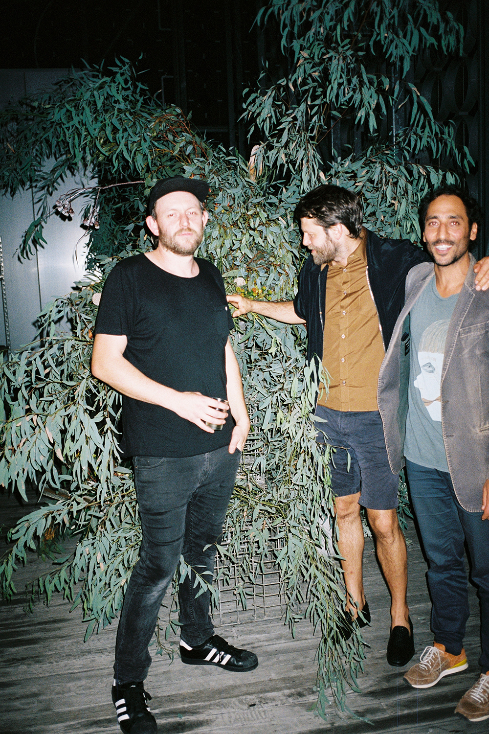
Sean, Martino, Nectar and the natives
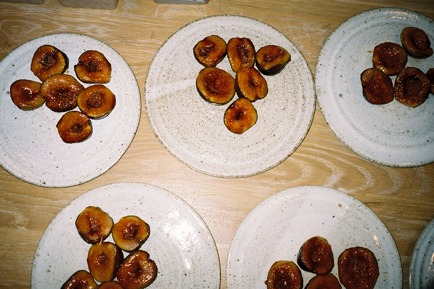
Figs on plates by North Carlton Ceramics
Natives by Cecilia Fox
Two hands and something tasty
Tin
Kate and her red bag
Meal by Monster
Georgie, Pino and Ed
Good times
