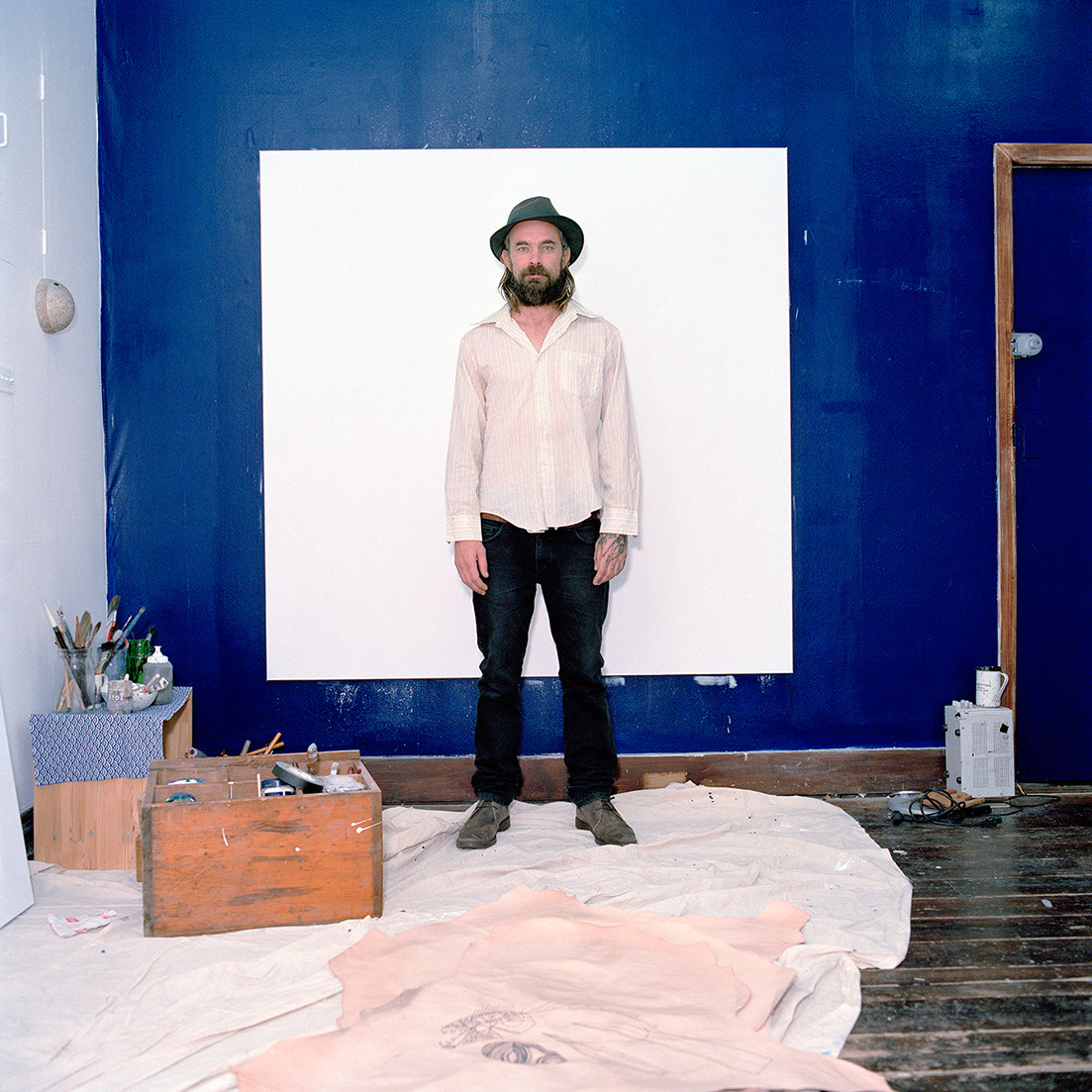
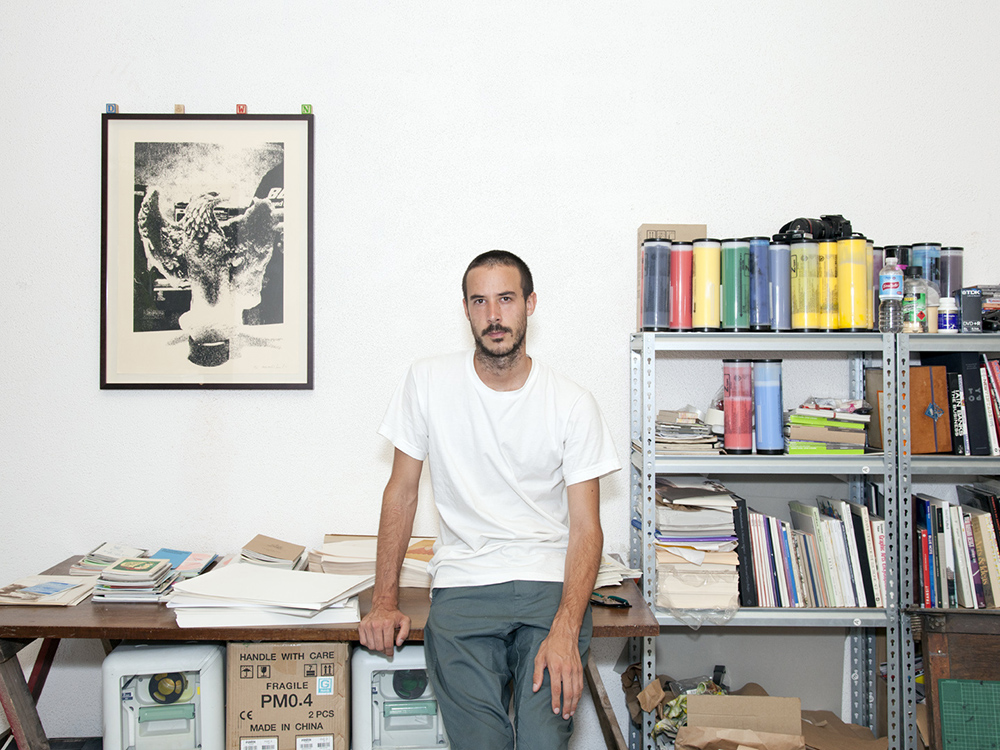
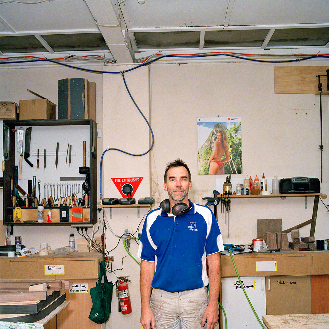
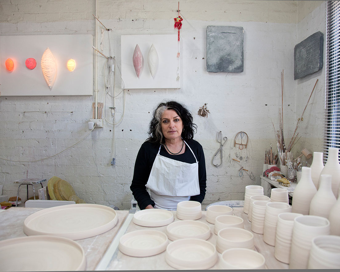
This is Xavier of Dawn Press, the laid-back, ever-patient riso dude who helped us figure out the best way to print our stationary.
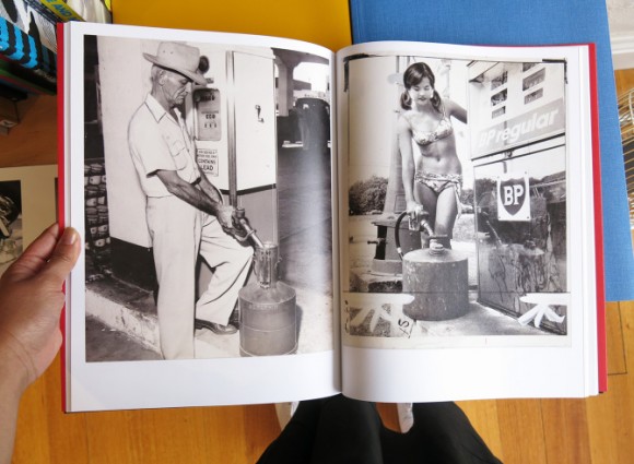
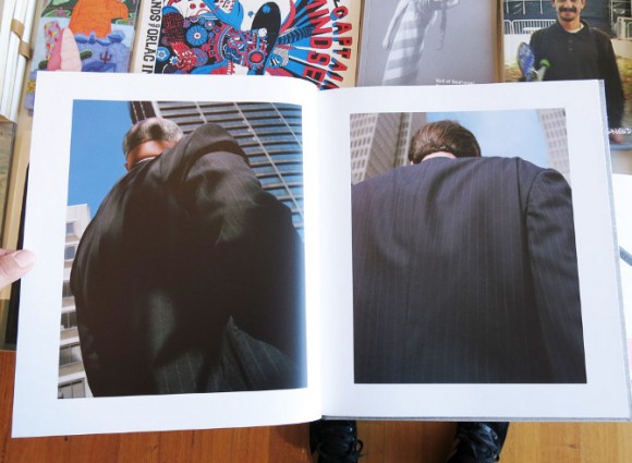
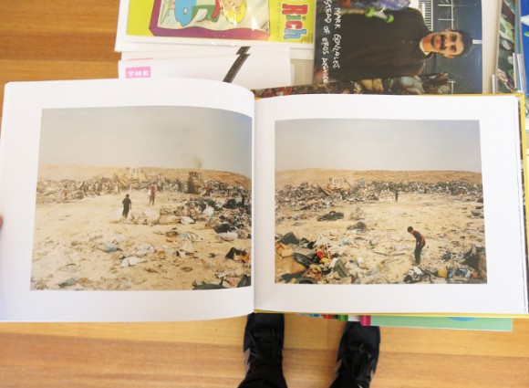
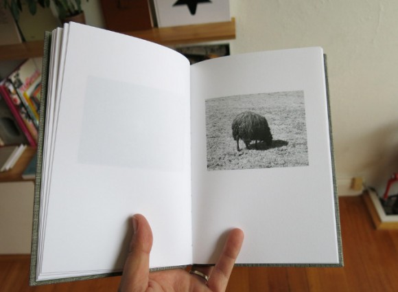
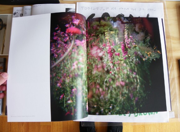
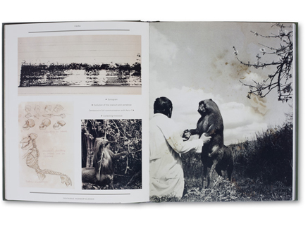
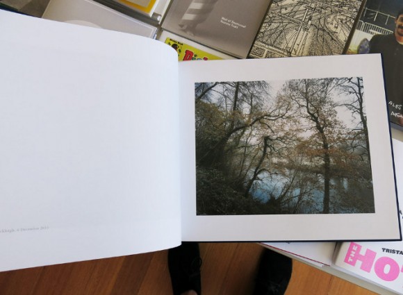
Xavier started out as a photographer looking for a way to print a book of his works without having to pimp himself out to pay the printing bill. Surrounded by artist and designer friends looking around for something similar, after researching the Risograph printer, he decided to go ahead and buy one. As a photographer a bit turned off by the move from analogue to digital, the riso was a nice way for Xavier to mess about with stuff as he did in the dark room… With a bit more light and a few less chemicals.
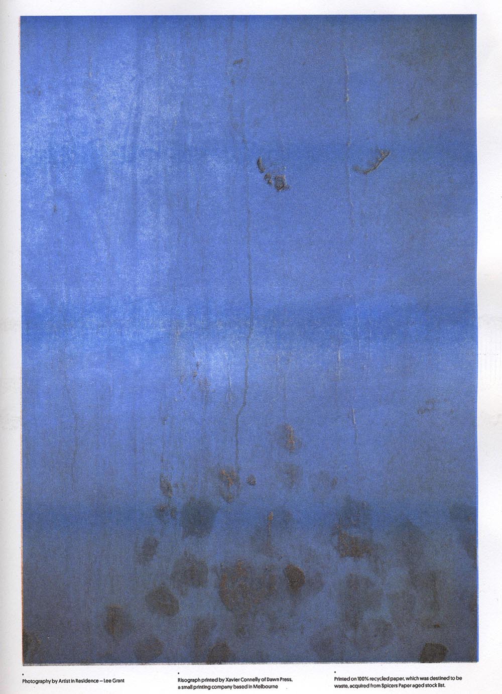
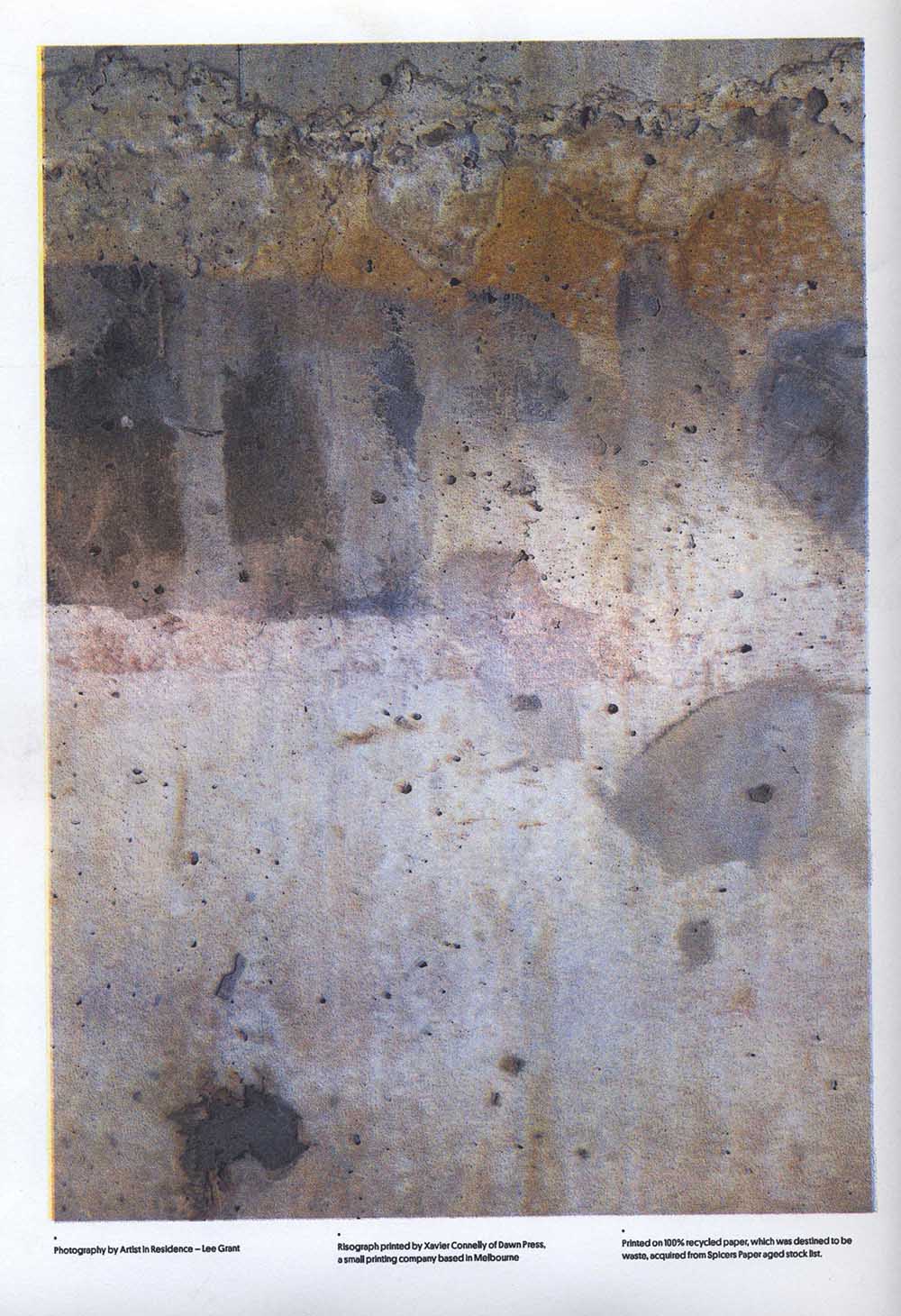
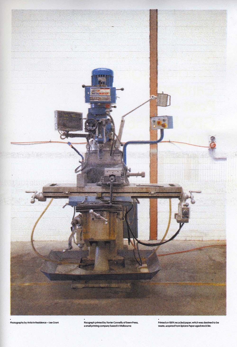
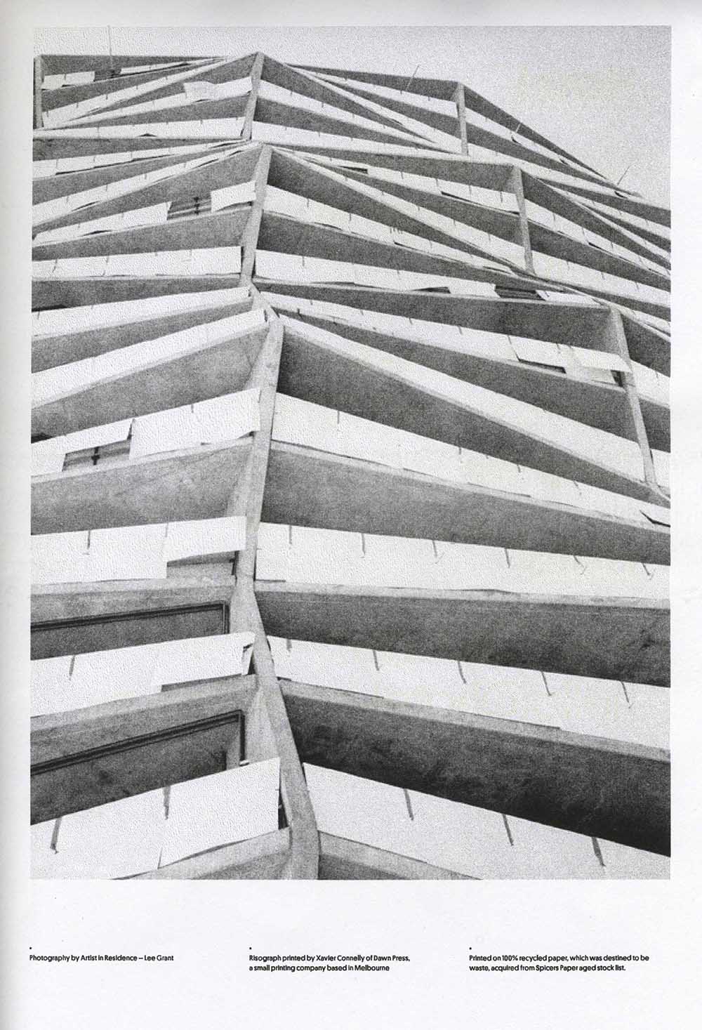
As Xavier says, it’s probably the only printing process where people come to you and say “I want it to look fucked up”. At a traditional printer you keep your eye out for imperfections with the final product and when you find them you usually have a good old yell at the printer. Not so with the riso, the beauty is often in the imperfections. Just like a screen print where each layer of ink is applied one after the other, the alignment of each layer will probably be a bit off. What you get is a one off piece of printing (even if you have set the machine to print say 200 copies of something) where each bit of paper that comes out the end as its own little piece of art. You shouldn’t set out for that fucked up look though says Xavier, it’s about doing a good job on the print, experimenting and having a surprise at the end of a job (no, gutter face).
Xavier talks about the riso machine as a way to express the idea of things, the feeling of things, rather than being an exact copy of the things themselves.
As well as the artistic values of the process, Xavier also points out the opportunity to apply printing hierarchy according to use. Single use items such as letters can be printed with just one or two colours, thus saving on the use of inks (saving money and resources) whereas more treasured, multiple-use items like menus or postcards can use more colours.
