bubble heart
Monster Kitchen and Bar Open! Book
Hotel Hotel Thursday 0:44 AM

Object Therapy

The Object Therapy exhibition opens on Friday 14 October at the Grand Stair (at Hotel Hotel in NewActon) at 6PM and will be on show until Sunday 30 October.

Object Therapy is a research and remaking project that we carried out as part of our Fix and Make program.

Through this practical study of repair we hope to build a new body of knowledge around repair, the design process, and objects and their meaning.

Often, repaired objects are perceived as being of less value. We are looking to challenge this preconception, celebrating repair as a creative process that can add value.

We hope that it will help us rethink our consumption patterns and re-evaluate the broken objects that surround us. It explores the almost forgotten role of repair in our society and its possibilities.

It’s also an enquiry into humanity. The project examines why and how we load inanimate objects with meaning.

The project has been developed in collaboration with the University of New South Wales (UNSW) the Australian National University (ANU). Through a research-based approach it is an investigation into the culture of ‘transformative’ repair as practiced by local, interstate and international artists and designers.

Back in May (2016) we did a call out to the public asking people to give us their broken or damaged objects for possible repair. From the 70 submissions, we chose 30 objects for repair including furniture items, ceramics, household appliances, textiles, sentimental objects and, unexpectedly, one human.

When they came to drop it off we interviewed each person about their object. They were asked a series of questions including how they came to own the object, how it broke and how they would like to see it repaired…

We found that some of our straightforward questions drew out personal (and sometimes quite moving) stories that highlight the power that objects have to connect us to people, places and the past. We also uncovered some attitudes towards repair and perceptions on waste.

The object owners were then asked to ‘let go’ of their objects. We let them know that the process of repair might mean that their object would come back completely different… both in terms of how it looks and functions.

We then gave each object to a design repairer. We gave them the background research as well (the video interviews) so that they could understand the owner’s relationship with the object. The repairers had six weeks to mend or transform the object.

Then we reunited the owner with their object. We did a second interview to see their response to the repair and to see if and how their attitudes or perceptions might have changed.

We are very grateful for the goodwill that the repairers have shown us by taking part in this project. They spent much time and thought on their repairs. (Thanks guys. We’re glad you’re here.)

We are also in much karmic debt to the researchers – Guy Keulemans, Andy Marks, Niklavs Rubenis and their team for all of their hard work and commitment to this project. We thank you. Believing in things is catching. We hope you infect everyone.

And thank you to the object owners for trusting us with your (almost always) beloved objects.

We have put together an exhibition of the repaired objects. It opens on Friday 14 October at the Grand Stair (at Hotel Hotel in NewActon) at 6PM and will be on show until Sunday 30 October. We hope you can come.

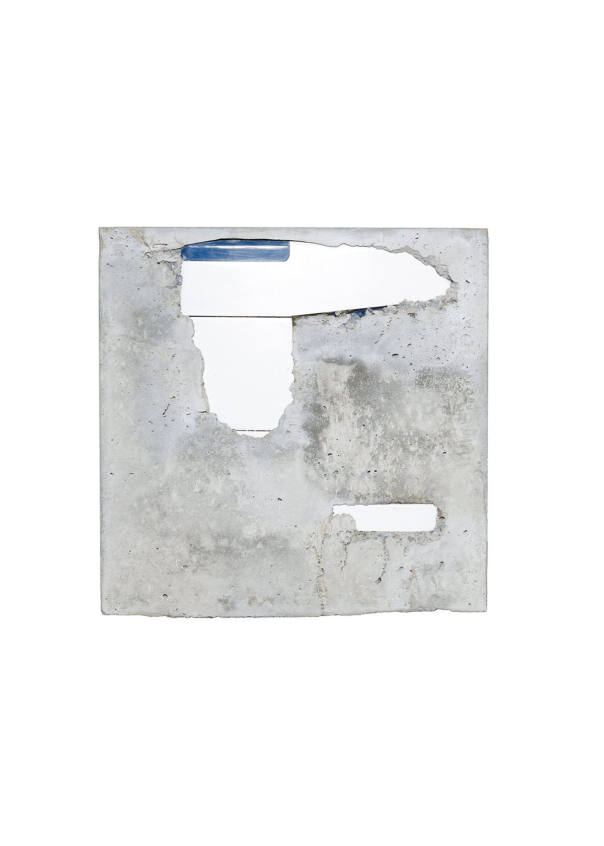
Image by Lee Grant of Kristie’s broken Kenwood mixer given to her by her parents for her 21st. Repaired by Rohan Nicol – reminiscent of an archeological artifact, he has locked the object in cement, fixing in time the often-invisible bonds between family members.


Repairers

Andrea Bandoni, São Paulo, Brazil

Corr Blimey (Louisa de Smet and Steven Wright), Cardiff Wales, UK

Susannah Bourke, Queanbeyan, Australia

Elise Cakebread, Melbourne, Australia

Franchesca Cubillo, Canberra, Australia

Elbowrkshp (Elliat Rich and James B. Young), Alice Springs, Australia

Daniel Emma, Adelaide, Australia

Dale Hardiman, Melbourne, Australia

Benja Harney, Sydney Australia

Kyoko Hashimoto, Sydney, Australia

Alison Jackson, Queanbeyan, Australia

Trent Jansen, Thirroul, Australia

Guy Keulemans, Sydney Australia

Dylan Martorell, Melbourne, Australia

Scott Mitchell, Melbourne, Australia

Liam Mugavin, Sydney, Australia

Rohan Nicol, Canberra, Australia

Monique van Nieuwland, Canberra, Australia

Yutaka Ohtaki, Murakami, Japan

Halie Rubenis, Queanbeyan, Australia

Niklavs Rubenis, Queanbeyan, Australia

SMaRT@UNSW, Sydney, Australia

Naomi Taplin, Sydney, Australia

Thought Collider (Mike Thompson and Susana Cámara Leret), Amsterdam, The Netherlands

Henry Wilson, Sydney, Australia

Richard Whiteley, Canberra, Australia.
Permalink, Share on Twitter or

Cucumber and lime granita

Makes one litre

Ingredients

  • 500ml lime juice
    500ml cucumber juice
    1 bunch mint
    200g caster sugar
    200ml water

Method

Granita

Pick mint and blanch it in boiling water for 30 seconds. Then refresh it by dunking it in iced water.

Squeeze out the excess water and chop the mint finely.

Place sugar and water in a pot and bring to the boil until the sugar dissolves.

Mix all of your ingredients together and put them in a medium sized tray and place in the freezer.

Freeze for 20 minutes or until ice crystals start to form. Using a fork to scrape the crystals to the side. Continue scraping every 20 minutes until it all becomes ice crystals.

To serve

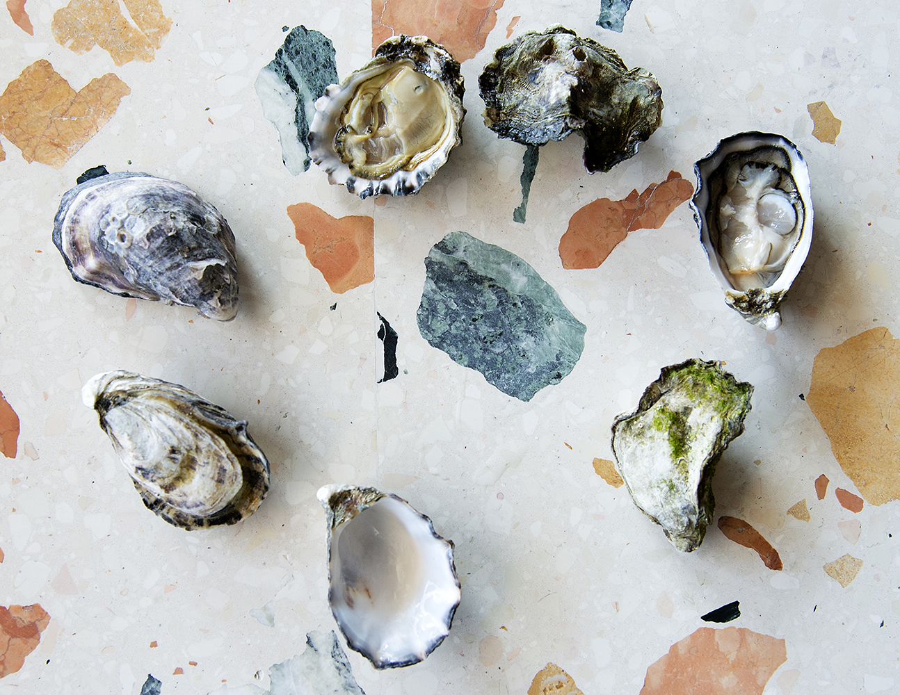
Place a teaspoon of your granita onto your oyster of choice (for these we use Moonlight Flat Oysters).

Permalink, Share on Twitter or

A fold of chairs

The collective noun for chairs is a fold of chairs. There is also such a thing as a fold of sheep. And a fold of cattle. An unkindness of ravens. A flight of stairs. There is a mob of wombats. A blush of boys. And some say a beautification of spatulas...

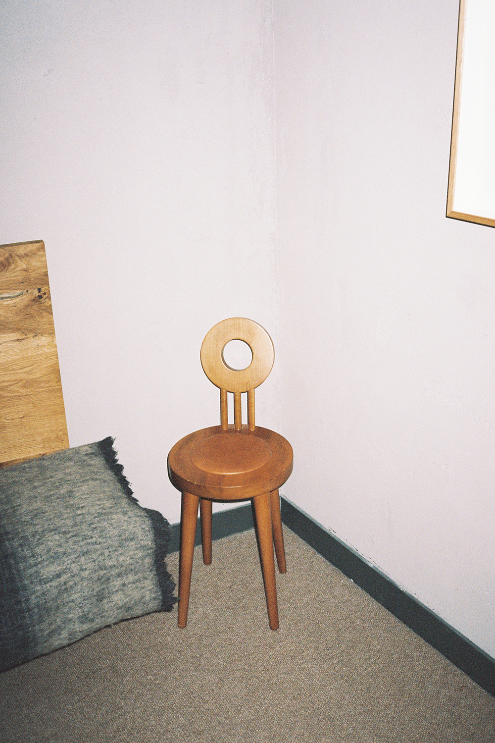
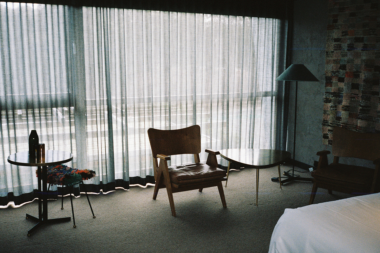
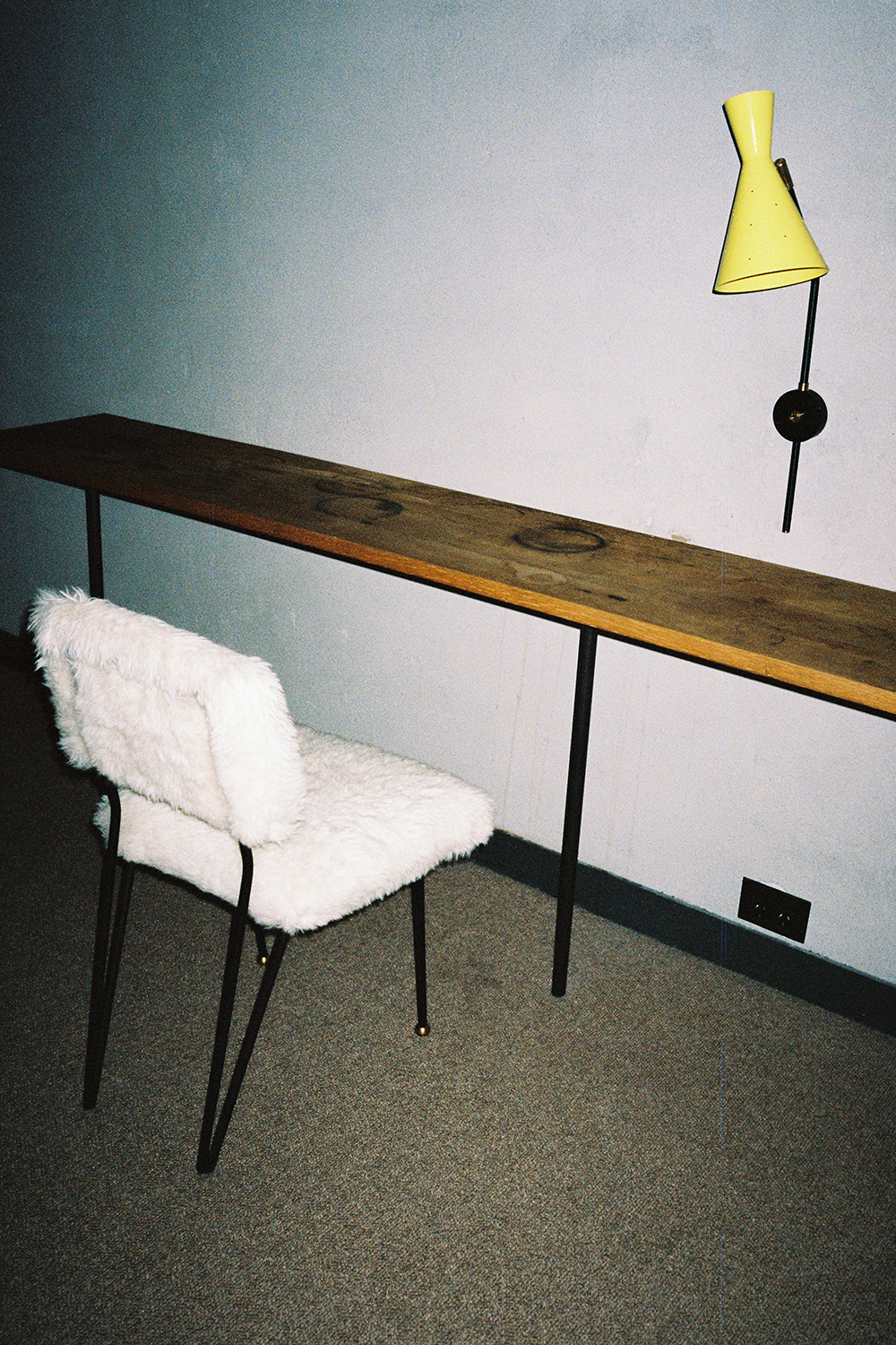
Hotel Hotel room chair shot by U-P.
Chair in Creative room number 209 shot by U-P.
Hotel Hotel room chair shot by U-P.
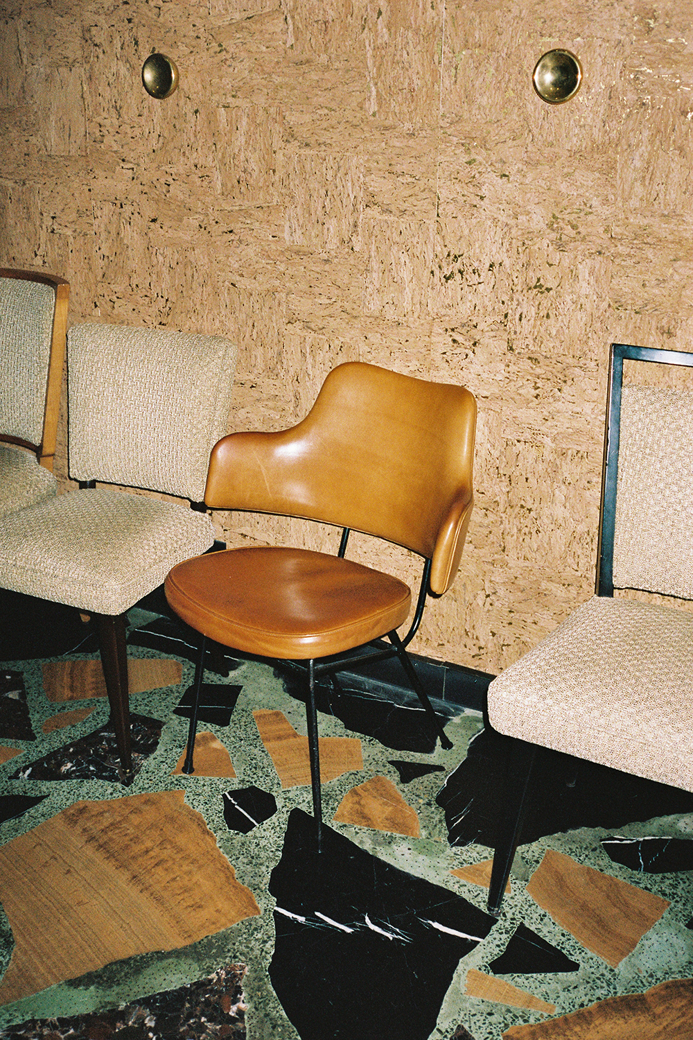
Monster Salon chair shot by U-P.
Monster Dining room chair shot by U-P.
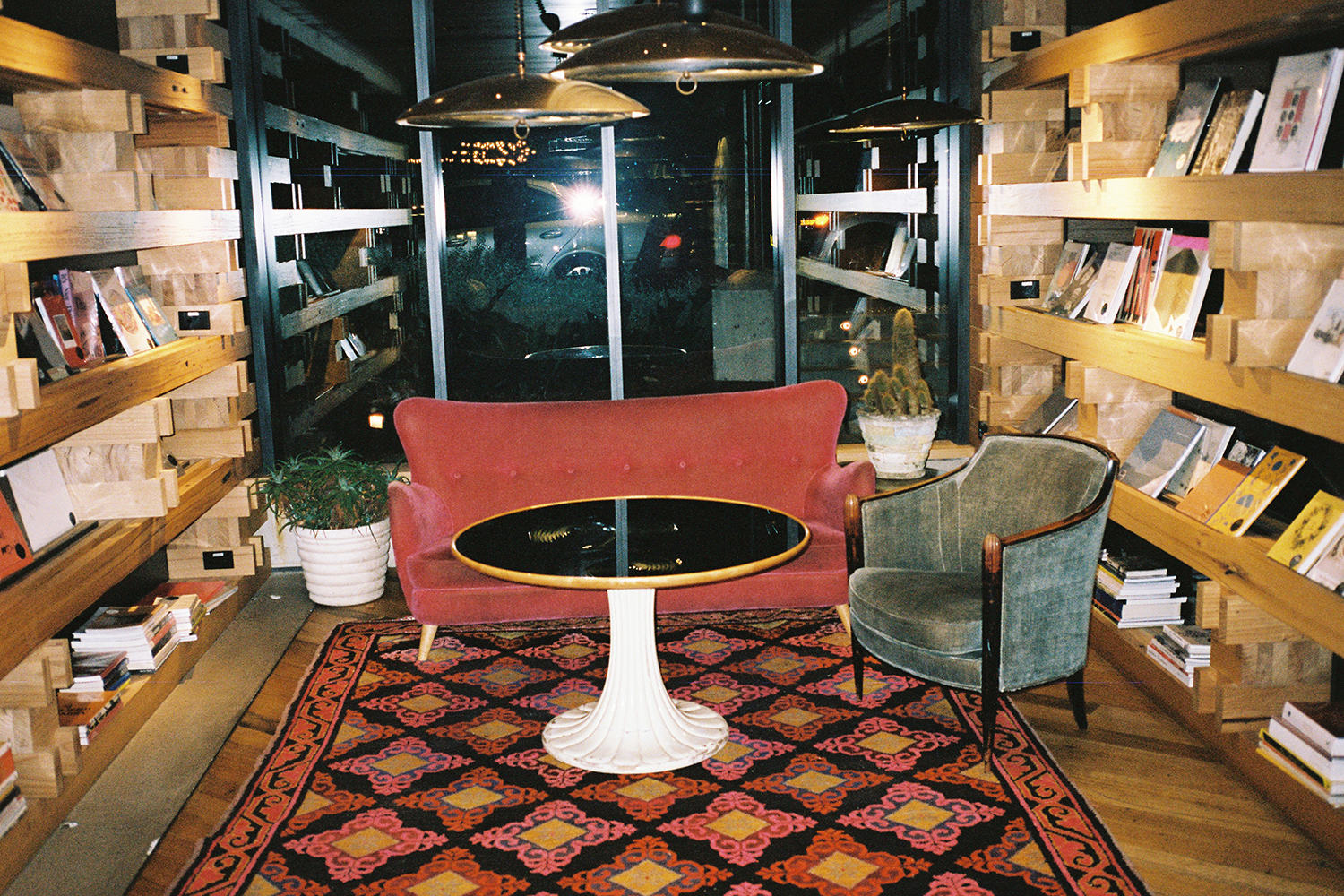
Library chairs shot by U-P.
Monster Salon chair shot by U-P.
Monster Salon chairs shot by U-P.

Permalink, Share on Twitter or

The Story of the Salon and Dining rooms

The story of the design of the Monster’s Salon and Dining rooms may not be one that you’d expect.

It draws on a rich and important chapter of Australian immigration – a re-interpretation of the suburban family rooms of immigrants in Australia from the 1940s to 1980s, post WWII.

It is a layered story of domestic places.

It is at once a parlour for receiving guests, for talking art and politics, a living room for lolling around by the fire with friends, and a room for sharing meals.

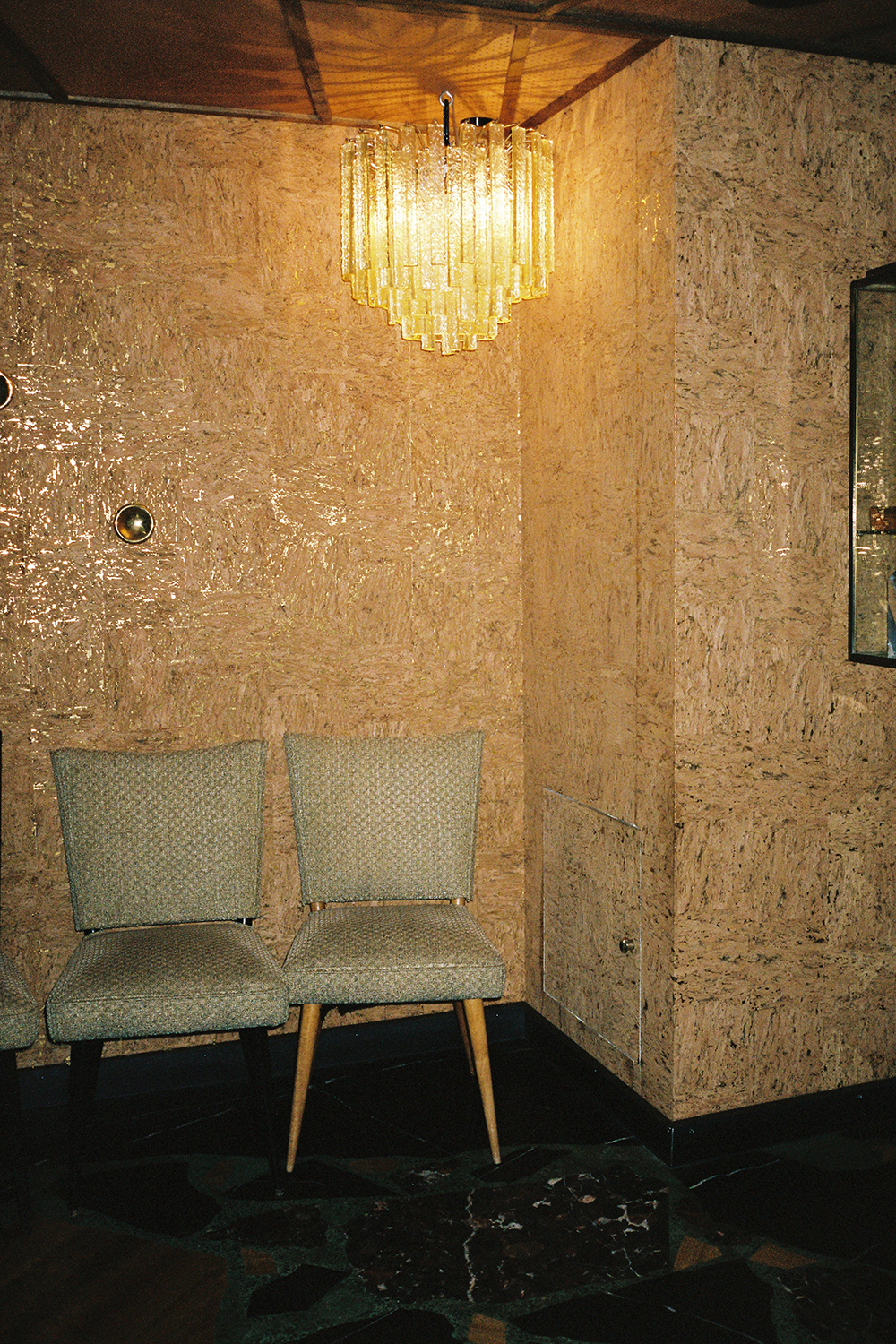
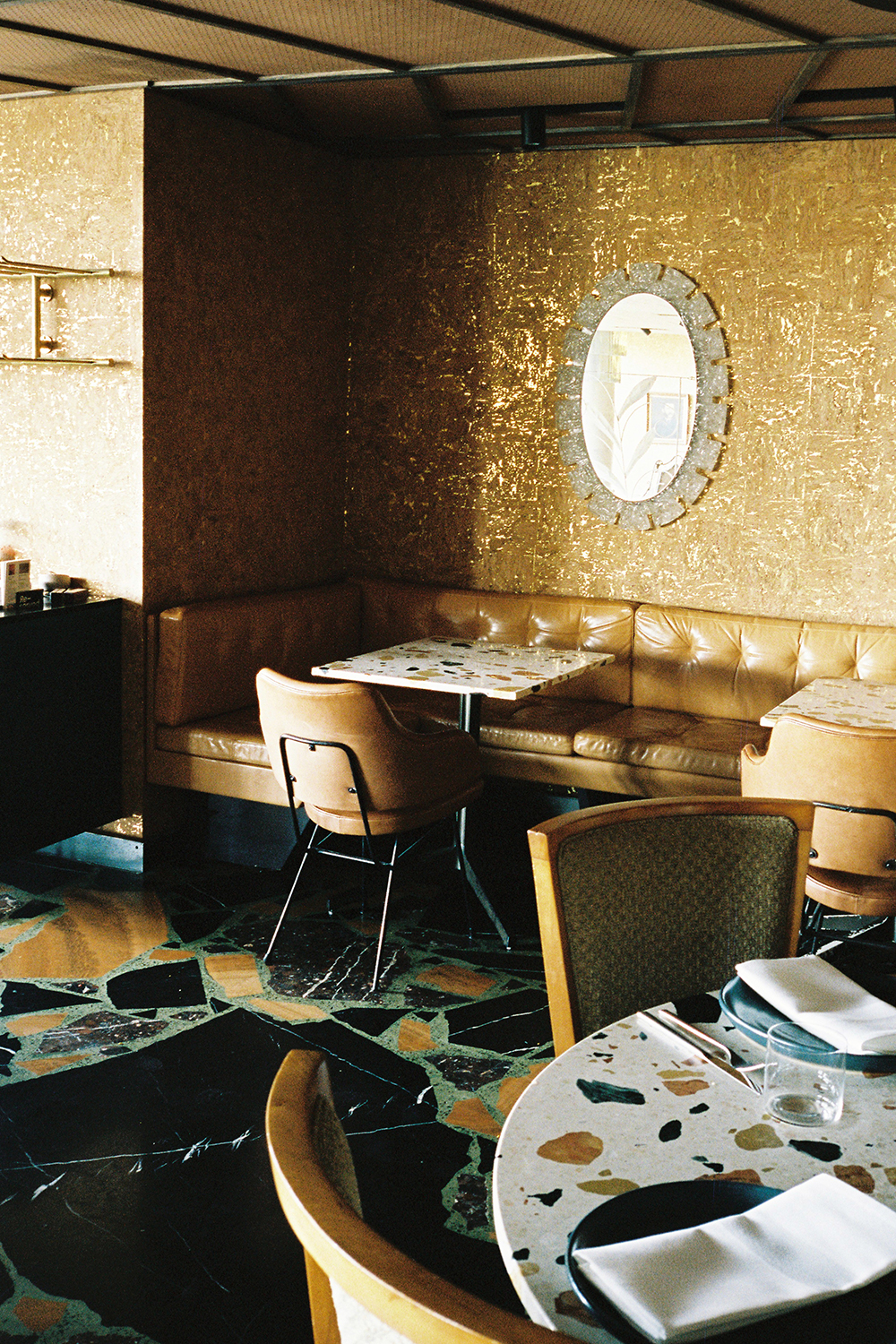
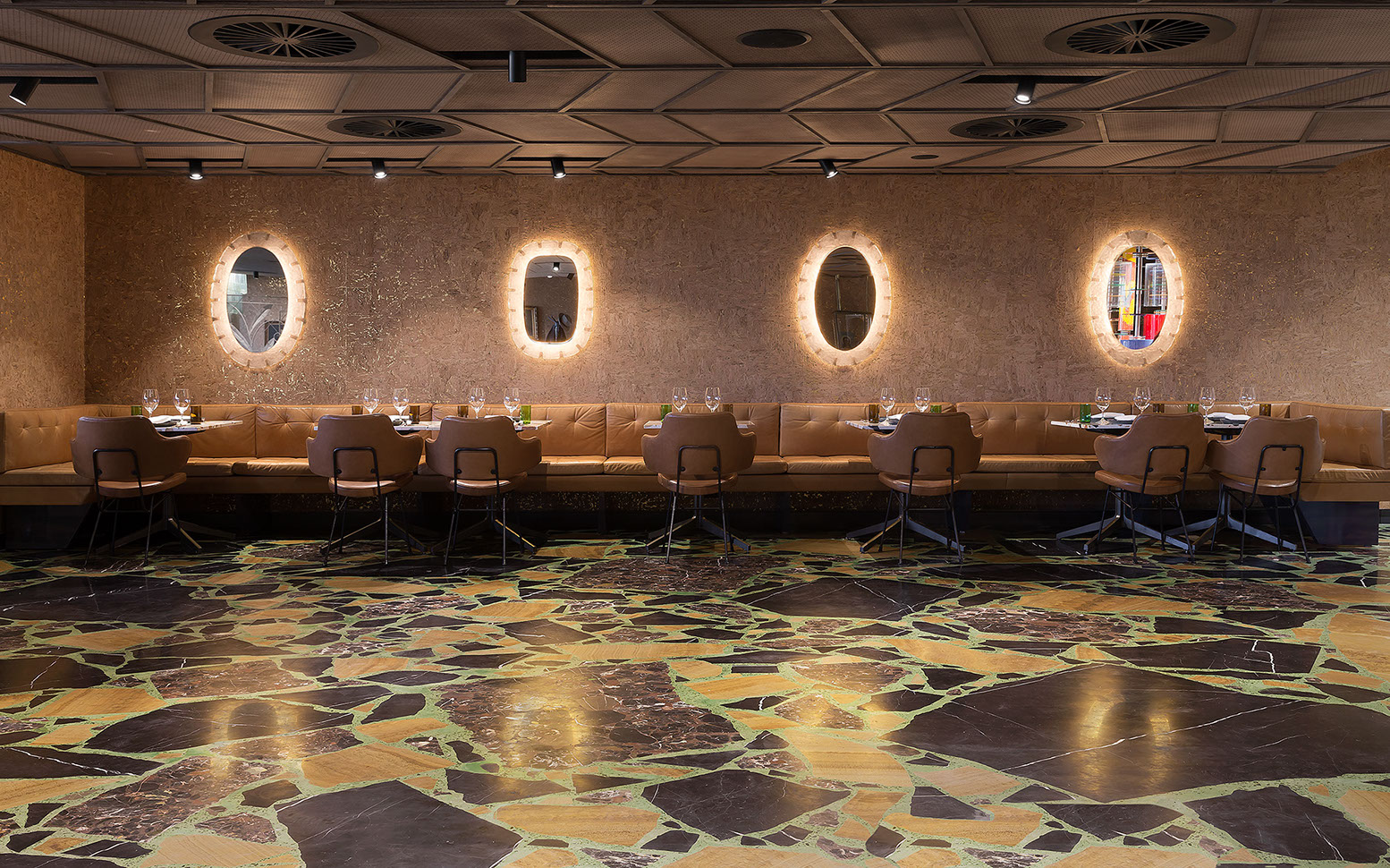
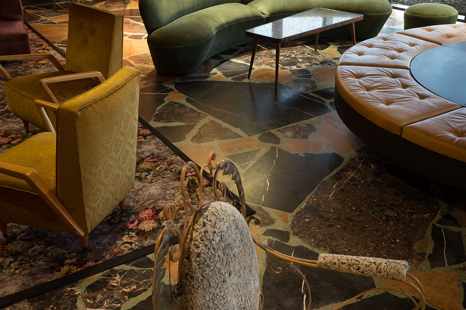
The floor is a monolithic polished shattered terrazzo with hidalgoite green oxide seams. Terrazzo was first invented by construction workers in Venice – a low cost way to tile their living rooms with off cuts from work that they sealed with goat’s milk.

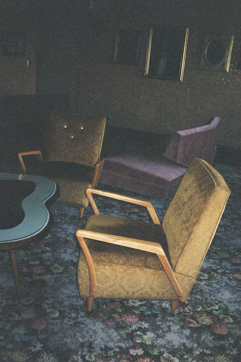
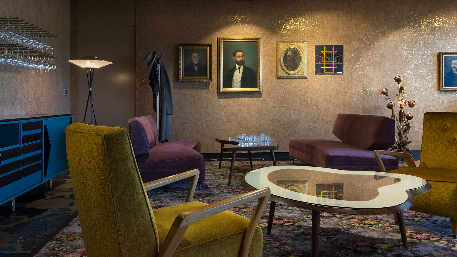
An original and unused early 1950s floral-pattern Axminister broadloom carpet from England has been remade as a rug that provides a setting for a collection of armchairs designed by Viennese furniture maker Paul Ernst Kafka who himself emigrated to Australia in 1939.

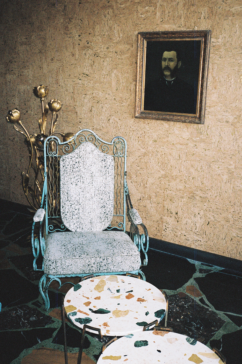
The rest of the seating is an assembly of Australian vintage boomerang lounges that sit alongside wireframe chairs and original decorative painted metal screens. They sidle up to Kafka side tables and Max Lamb designed nougat-like Marmoreal tables, and engineered marble fashioned by Molonglo Group and its collaborators into dining tables.

Perspex mirrors and plexi-bead columns and totems honour the often over-the-top indulgent adornment of many of the proud suburban lounges of the newly arrived at that time.

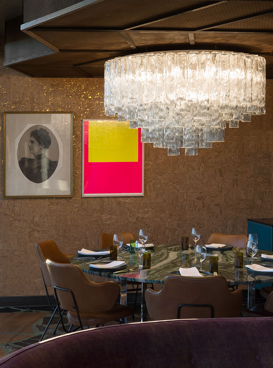
The spaces are illuminated with domestic table lamps alongside a massive 1970’s Barovier & Toso Murano chandelier suspended low over a wild veined green quartzite feasting table that comfortably seats up to ten diners.

Shards of 1960s Mazzega opaline glass have been re-appropriated to create a custom column light.

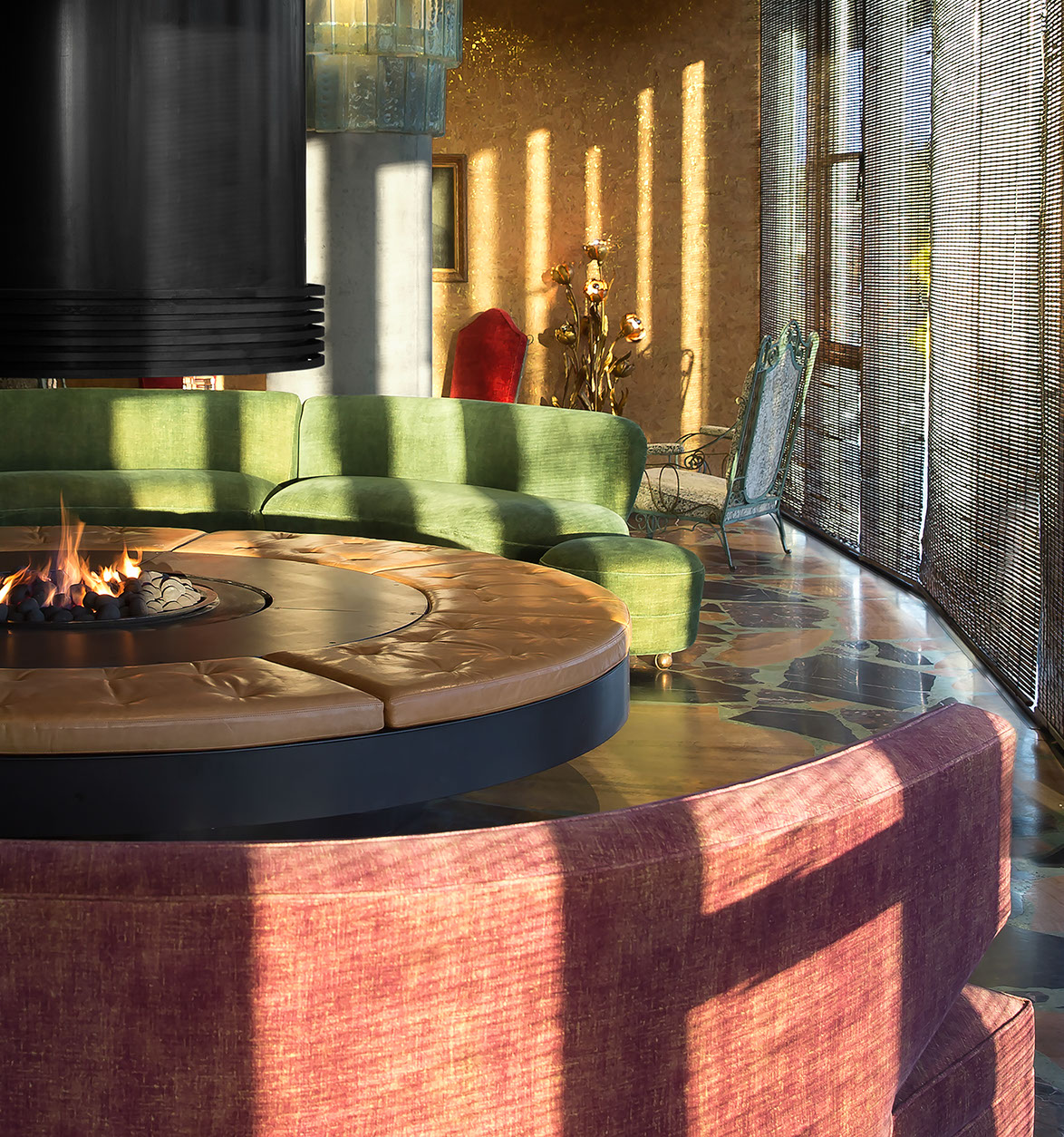
The in-the-round fireplace is the heart of the rooms – the centerpiece back-warmer to settle new arrivals in from chilly winter evenings. Views across Lake Burley Griffin to Parliament House and the surrounding mountains contextualise the space into its uniquely Australian landscape.

An eclectic mix of Greek icons, 1850s oil paintings and 1960s neon prints as well as objects collected in curiosity shops and flea markets gild the whole, telling precious folk stories, which if left untold would disappear.

This chapter is about how immigration increases the textures, layers and dimensions of a place’s cultural fabric.

It is an important story. Especially in a time when the number of people displaced by conflict is at its highest number ever since the aftermath of WWII.

It is a combination of old and borrowed ways that at once salutes the past and act as an offering in the hope for pluralism and diversity now and in the future.

Permalink, Share on Twitter or

Maurice’s Monsters

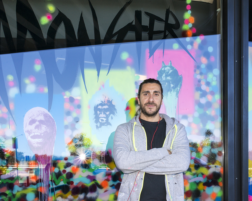
Maurice Golotta did the paintings on the outside of the Salon and Dining rooms at the Monster kitchen and bar… A crazy ass mix of the abstract, colours, and fittingly, monsters.

Read more

Permalink, Share on Twitter or

#hotelhotel #hotelhotel #hotelhotel #hotelhotel #hotelhotel

When Lisa Sorgini Slept Over

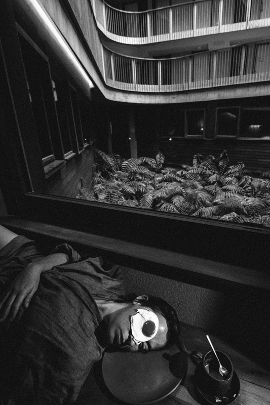
Lisa Sorgini came and slept over the other week. She gave a new nice meaning to getting egg on your face. On her way back to Melbourne she stopped at Kosciuszko National Park and looked at the mountains.

Permalink, Share on Twitter or

View All: Quotes

Bye Swarm Traps

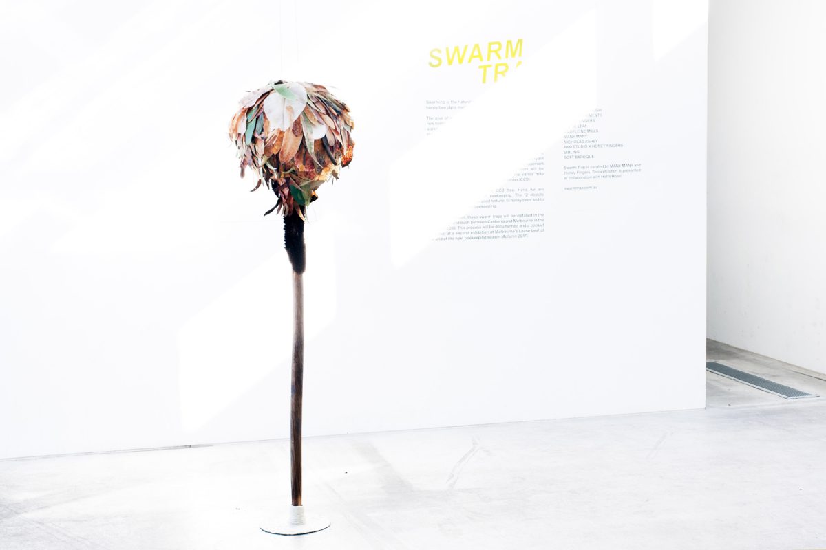
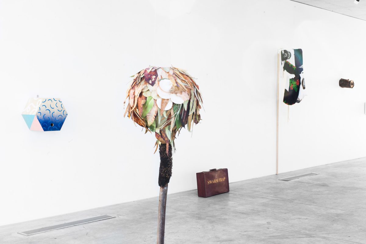
‘Swarm Trap’ was an exhibition curated by MANY MANY and Honey Fingers. Together, we presented it at the Nishi Gallery, here in Canberra, back in June.

The exhibition was a collection of swarm traps (safe houses for bees) made by artists, designers and makers in their mutual admiration for the clever and generous animal that is the bee.

Today, now that Spring has finally arrived, these swarm traps are heading off to be installed in city, suburb and bush sites between here and Melbourne.

We’re waving them goodbye and blessing them all in the hope that they all prove to be a comfy safe house for bees looking for a new home.

'Hello Spooky' by Madeleine Mills. Shot by Charlie White.

'Bees in Trees' by Honey Fingers and carpenter René Mancuso. Shot by Charlie White.

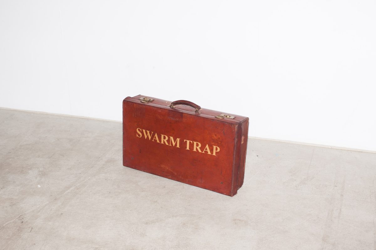
'Suitcase' by Ben Blakebrough. Shot by Charlie White.

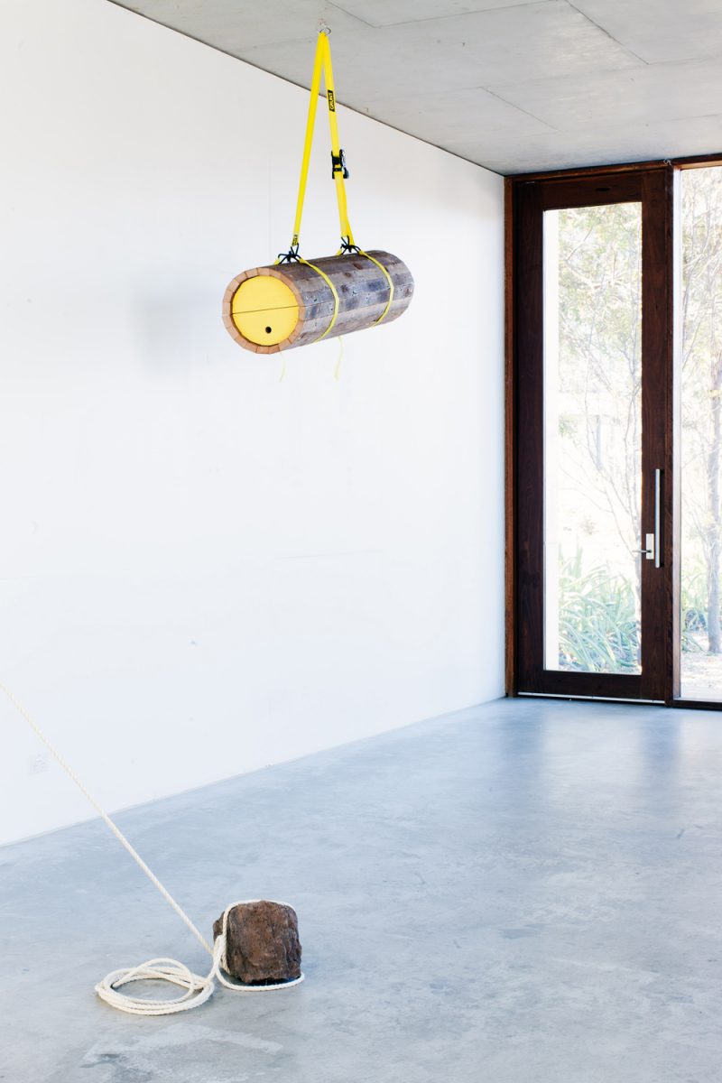
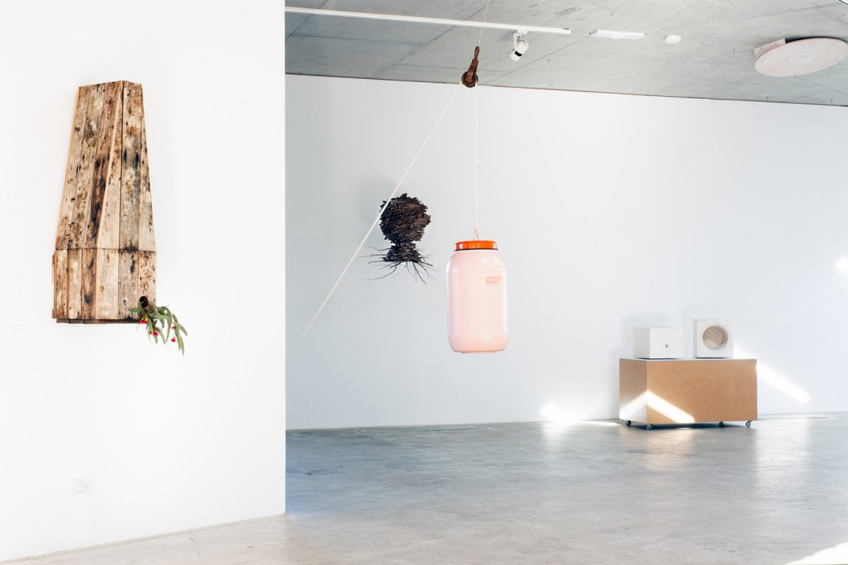
'60L Drum' by Field Experiments. Shot by Charlie White.

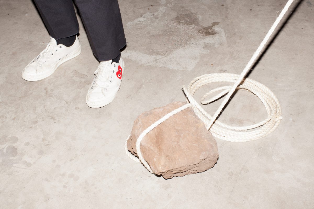
Rock from '60L Drum' by Field Experiments. Shot by Charlie White.

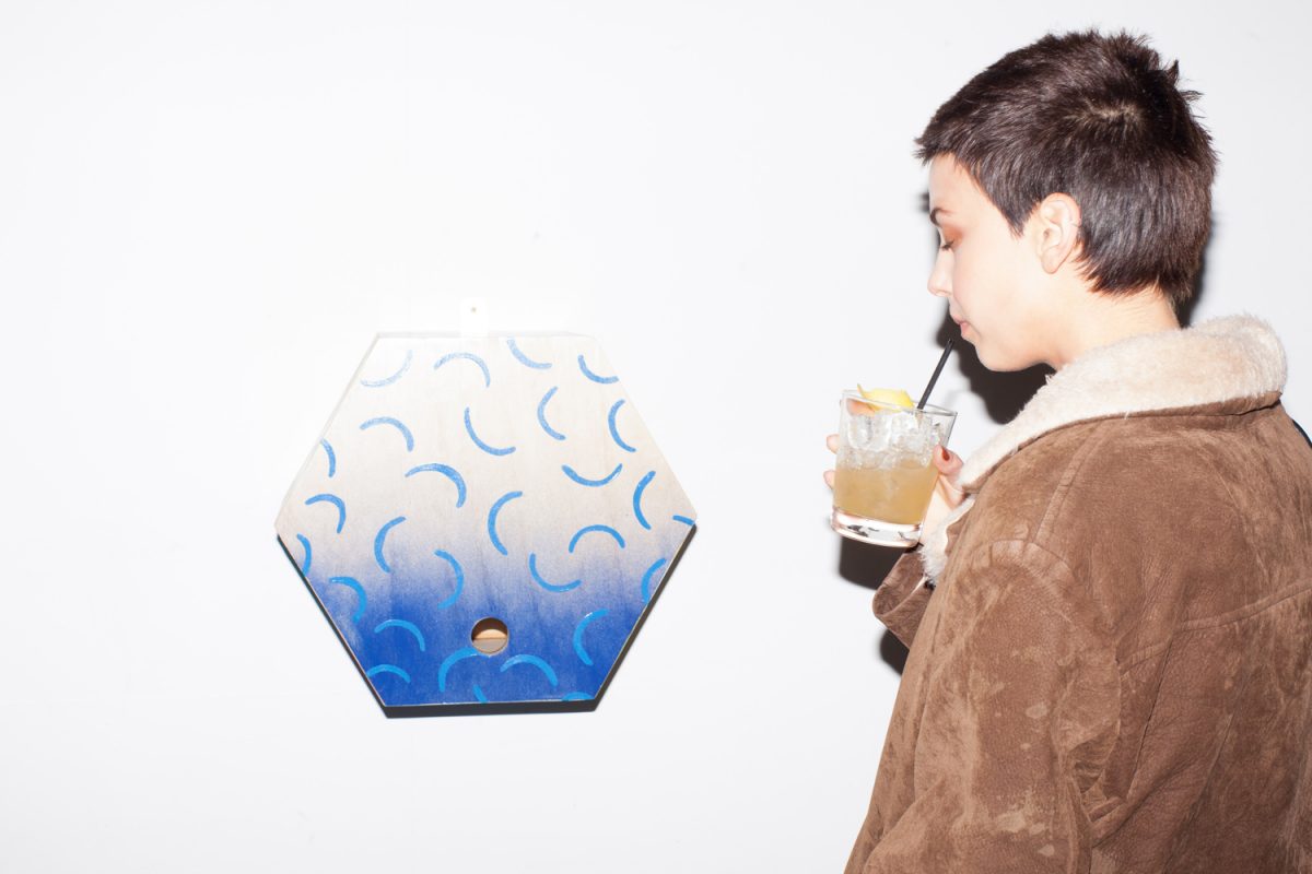
'Hexagonal Flower' by Beci Orpin. Shot by Charlie White.

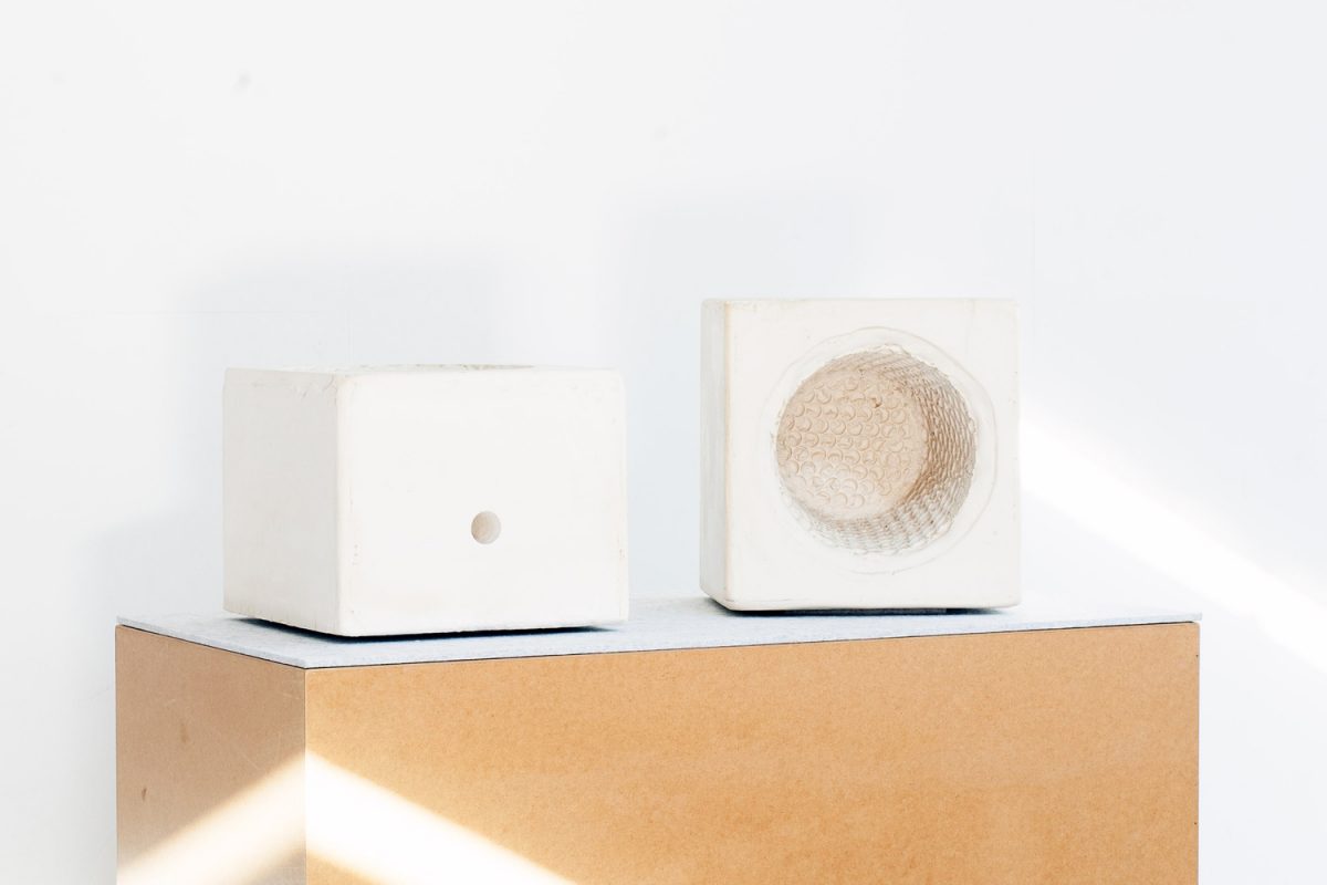
'Negative (Bee) Space' by MANY MANY. Shot by Charlie White.

'Swarm Catcher' by PAM Studio and Honey Fingers (fourth work from the left). Shot by Charlie White.

'A Foreign Object From an Alien World, To Tempt the Curious Bee' by Nicholas Ashby. Shot by Charlie White.

'Artificial Branch' by Soft Baroque. Shot by Charlie White.

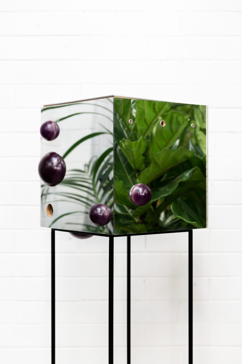
'Beezindatrap' by SIBLING. Shot by Janelle Low

'Big Roof' by Honey Fingers and carpenter John Arvanitis. Shot by Charlie White.

'Pat' by Charlie Lawler and Wona Bae of Loose Leaf. Shot by Charlie White.

‘Hello Spooky’ by Madeleine Mills.

Clay polymer, stoneware clay, organic matter, beeswax, propolis, tissue paper, plaster, wire.

1700mm x 400mm x 400mm

Born out of a child-like playfulness through which Madeleine Mills like to engage with material, this trap is a fusion of form and duty of care. Designed as a space that is safe, satiating and alluring for the bees, the attention to detail is at once acute and, in effect, unselfconscious. The layers of material have been built upon slowly and often spontaneously – its stoicism and autonomy revealing itself through the process. The trap stares back through the canopy of both uncanny and natural substances, ornamenting and embodying a sense of composite corporeality in our own human fabric.


‘Bees in Trees’ by Honey Fingers and carpenter René Mancuso.

Salvaged oregon, leftover paint, reusable ratchet straps.

1420mm x 360mm

Built to the 5000 year-old dimensions of the (still in-use) clay, cylindrical beehives of Egypt, ‘Bees in Trees’ is a nod to the traditions of beekeeping on the African continent, where empty cylindrical hives are suspended in trees to catch swarms and left in-situ, or moved to ground level, for the beekeeper to rob during the season. This hive will have an internal divider board (much like a Kenyan top bar hive) that will create an initial volume of 40L for a swarm to inhabit, but can be moved to create a larger volume for a growing colony to occupy. It will also have removable circular frames. This hive will be moved to ground level once bees have moved in. Interestingly, the volume of this hive – developed 5000 years ago – is equal to the volume of three eight-frame Langstroth boxes used today (a typical hive set-up in spring being two brood chambers + one honey super = three boxes).


‘Suitcase’ by Ben Blakebrough.

Leather suitcase (1930) with gold lettering.

660mm x 370mm x 140mm

For the on-the-move trapper. Ben Blakebrough’s mother used to have a swarm trap just like this one! Marcel Duchamp had one too, so did Albert Camus and Alan Ginsberg – he would read poetry to the swarm before attempting capture.

’60L Drum’ by Field Experiments.

Plastic, rope, rusted-steel pulley.

Field Experiments have made an ad hoc swarm trap from everyday found objects. The bung on a 60 litre plastic fermenter drum has been removed, providing the entry point for the bees. The drum hanging height is controlled by pulley system which can be adjusted to suit any environment. This trap is a reminder that we can work with items on hand to create new objects that fulfil a specific purpose.


‘Hexagonal Flower’ by Beci Orpin.

Plywood, glue, acrylic paint, varnish, metal.

430mm x 395mm x 300mm

Beci Orpin’s swarm trap is based on the naturally occurring shape of honeycomb – hexagon. She used lots of blue and yellow paint as these are the colours bees are most attracted to in nature. Beci hopes bees will think it’s a weird flower and fly right in. The swarm trap was designed and painted by Beci and constructed by James Reynolds.


‘Negative (Bee) Space’ by MANY MANY.

Plaster.

760mm x 380mm x 380mm

A common DIY swarm trap is made out of pressed fibre moulded by conjoined plastic buckets. MANY MANY sought to emphasise this traditional form by casting its negative space in plaster. The two halves – a plaster tower when closed – each have a different internal texture, creating a special interior ‘for the bees’ eyes only’.


‘Swarm Catcher’ by PAM Studio and Honey Fingers.

T-shirt, dowel, steel.

2600mm x 600mm x 400mm

A catcher rather than a trap, this device is popular in Europe for catching and relocating swarms that are within – or just out of – reach. The swarm can be closed inside the material funnel, and then gently shaken into a hive through the bottom of the funnel.


‘A Foreign Object From an Alien World, To Tempt the Curious Bee’ by Nicholas Ashby.

Aluminium, plastic, steel.

410mm x 330mm x 310mm

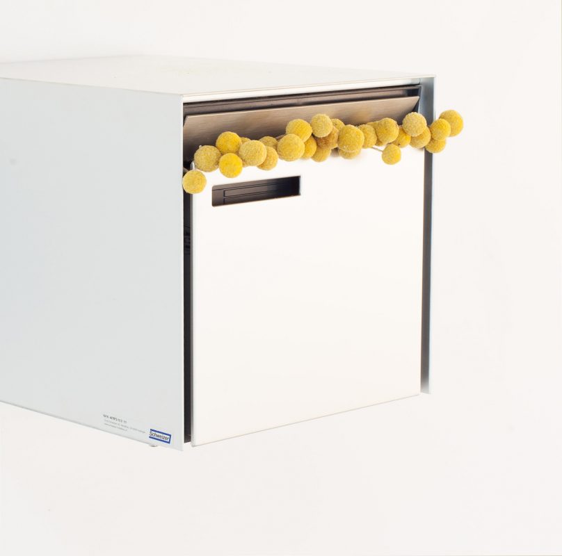
It’s not just that this perfectly refined design by the Swiss artist and designer Andreas Christen (1936-2006) is produced and finished to such beautiful exacting standards – the adoption of this classic by seemingly the entire Swiss population represents an acknowledgement that the question of how to receive mail is answered. Similarly, Nicholas Ashby believes our animal brothers and sisters are capable of a taste and appreciation for refined and utopian human-built technology. And that the question of artificially housing our bees should not be overthought with a muddle of archaic research from our own history.

Bees would be eager to move from the craft-driven nostalgic timber we usually build for them to a clean and reduced modern future. A system driven by rational standardisation and the total absence of individuality. An efficient and ever-expandable program for mass housing, leaving one free to create and dream beyond the immediate distraction of home and one’s heritage.

Humans and animals live together in the one kingdom – we need to share our riches.


‘Artificial Branch’ by Soft Baroque.

Ceramic.

350mm x 300mm x 250mm

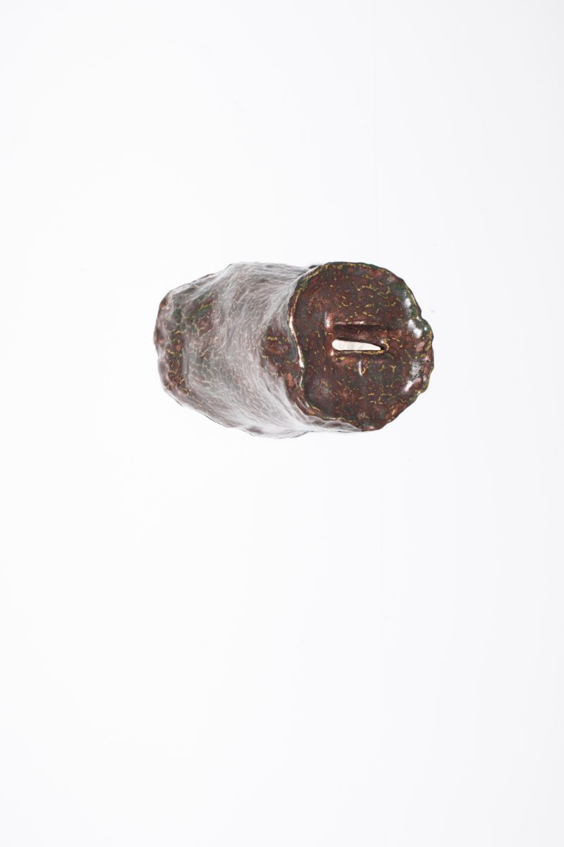
Bees naturally swarm to a hollow tree branch to create a new hive. This ceramic replica of a dead limb creates a reusable vessel that the bees will recognise instinctively as a new home.


‘Beezindatrap’ by SIBLING.

Hand-cast and dyed resin, mirror acrylic, plywood substrate.

350mm x 350mm x 350mm

Through their research, SIBLING became most interested in two things: that, in the wild, bees are most attracted to blue and purple followers; and that bees communicate to one another about their environment through dance. This led them to create a trap with a mirrored surface, with purple attractors. As the swarm trap hung outside the window of their fourth floor Melbourne CBD office, they watched as the box reflected both its environment and the bees themselves as they approached and danced across and around the surface.


‘Big Roof’ by Honey Fingers and carpenter John Arvanitis.

Salvaged timber floorboards, hardwood offcuts, reclaimed brass hinges.

1120mm x 340mm x 320mm

Constructed from the original bathroom floorboards salvaged from works on architect Robin Boyd’s ‘Lawrence House’ (1966-68) in Kew, Melbourne – and installed on that building’s garden wall for two years – ‘Big Roof’ is a play on taking the inside out and is a stab at creating a haughty, small-scale architectural monument, for bees. The trap itself is a box built to Prof. Thomas D. Seeley’s specifications with a big, hinged roof (the bees cannot access the roof’s void). It has caught one swarm that now lives in Carlton.


‘Pat’ by Charlie Lawler and Wona Bae of Loose Leaf.

Cork branches, steel wire, coconut husk.

500mm x 450mm

Charlie and Wona use natural materials to create both permanent and temporary artworks. Their swarm trap is inspired by the German ‘Sun Hive’ design. The suspended structure is created using tatami weaving techniques with cork branches. The hive is created in two sections and is designed to hang from a tree. The upper level contains a large chamber for the colony to gather in. At the base of the chamber is a round opening for bees to enter and exit. The lower level of the hive partially plugs the opening, giving the hive more protection, and provides a comfortable landing strip for the bees to enter the hive from any direction.

Permalink, Share on Twitter or

Of love and other things

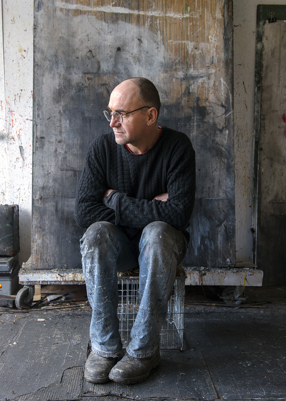
John Forrester Clack and his son Tobias Oliver Clack will be exhibiting ‘Marking the Spirit’ from Friday 19 August at 6PM at the Nishi Gallery until Sunday 11 September.

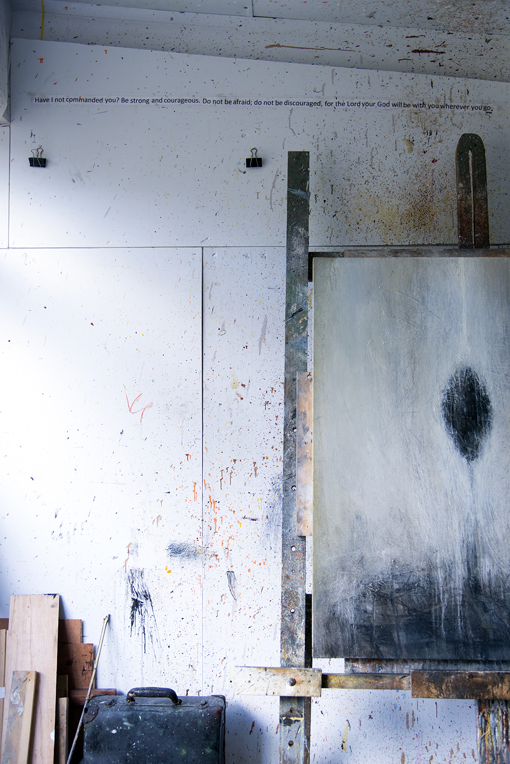
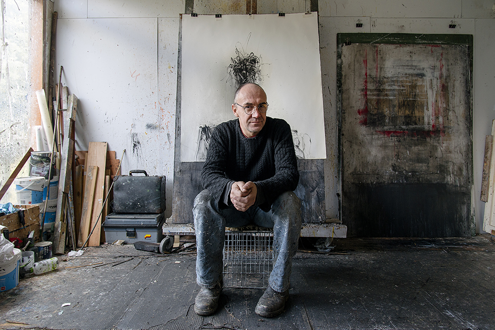
A few weeks ago, we went to visit John Forrester Clack at his home and studio in Gundaroo. We talked for a long time. Of his work, of love, and others things.

John’s work is self-exploratory. He draws, paints and sculpts, mainly self-portraits. Heads that draw on different emotions. In many ways it seems that John’s art is a way for him to reconcile himself within himself. “My pictures aren’t pretty pictures. They are about being deeply human as well as being deeply connected emotionally and spiritually”.

“What I’m doing as an artist is shedding skins. This is what I am today. You get it out and then you can leave that part on the floor.”

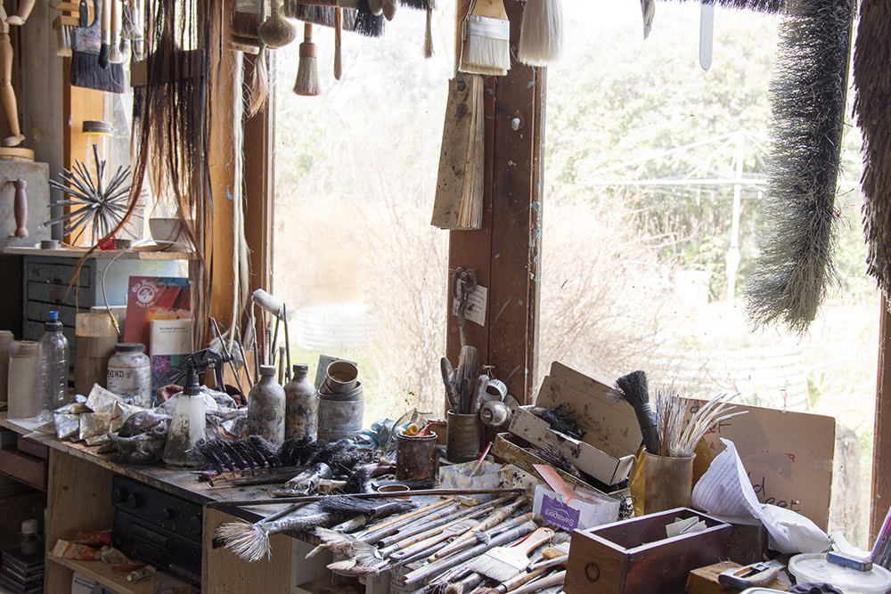
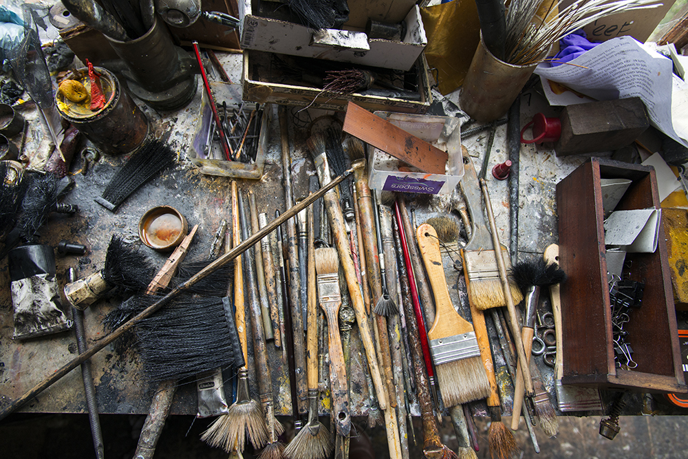
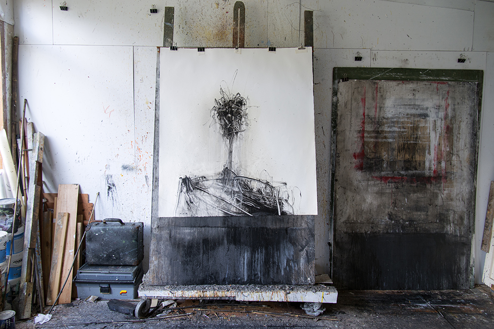
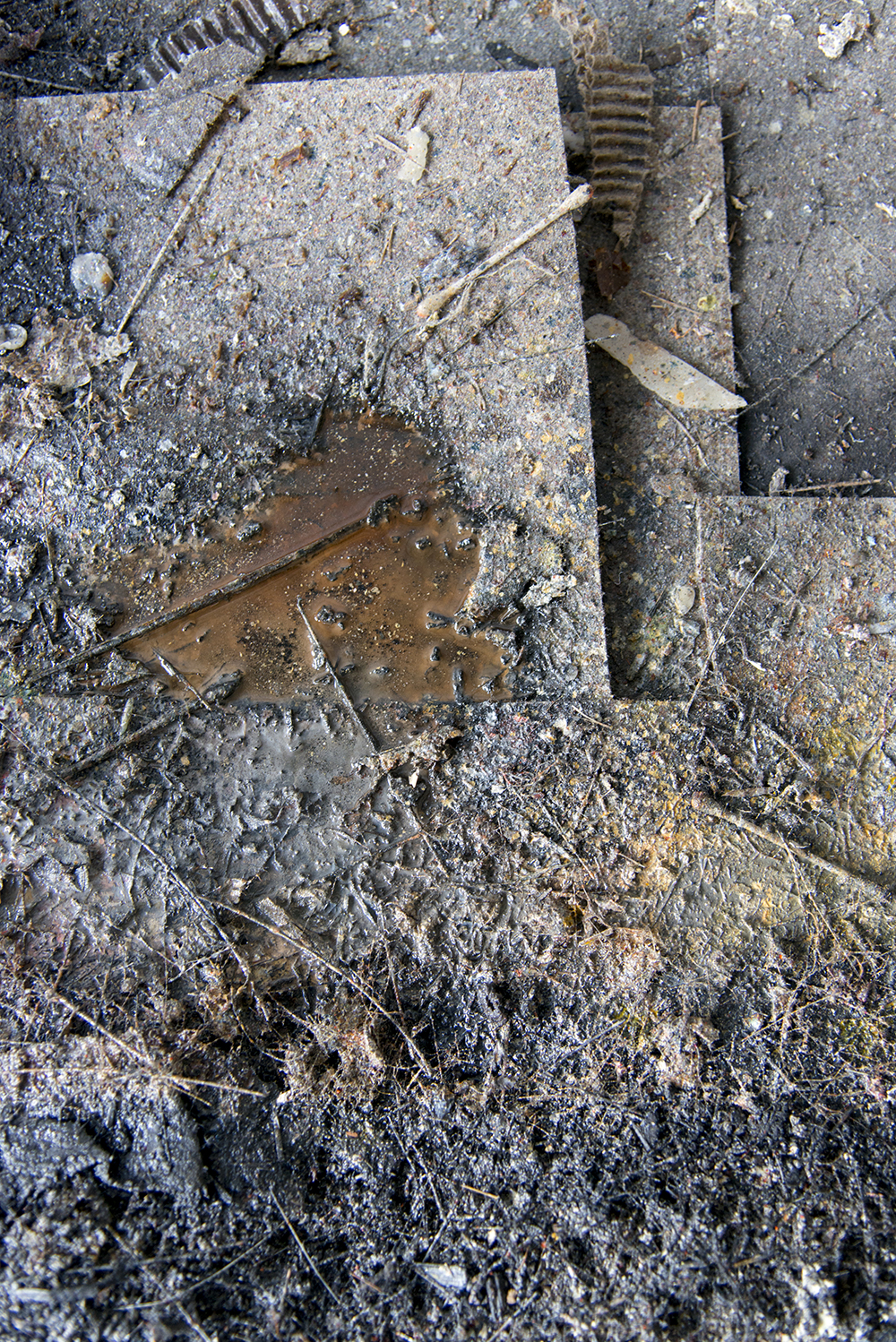
We talked in his studio, fitted with big windows for their generous natural light. John made the studio with his landlord whom he likes a lot. The door is pretty much always open to let the paint fumes out. The walls are covered in layers and layers of paint splatters, offcuts of wood lean up against the walls; tools and brushes hang from the ceiling.

“It’s grubby and oily and it stinks in here. But I feel free here.” John says.

He tells us the story of Francis Bacon and how he lived in a grotty bedsit studio in Reece Mews in London for years, painting away. And then he started selling his work for millions of pounds and so he took his bundle of cash and moved to a beautiful studio. But he found that he couldn’t paint in this nice new space… So he had to move back to the hovel.

The right space is important, John says. It helps you feel free to work things out.

“Part of making art is producing shit. You either have to change it, destroy it or start again. Sometimes it’s hard not to feel defeated.

You can work away for hours and not get anywhere, and then suddenly you experience this thing… This grace.

And then it works. I’m really grateful when it does. I think ‘that’s amazing, I can’t believe it’s there’.”

John grew up far away from his studio in Gundaroo, amongst the slag heaps of a mining valley in Wales. It sounds like it was a difficult place to grow up.

“For all the scars that childhood leaves us, it has given me a powerful engine, insight, a way to see things spiritually and emotionally.”

“My work is about embedded memory and emotion. And love. We share love. Love is really it. Art gave me a place to put it.”

It’s very fitting, given the nature of John’s work, this exploration of memory and love, that he will be exhibiting alongside his son Tobias.

Permalink, Share on Twitter or

The one that never eventuated

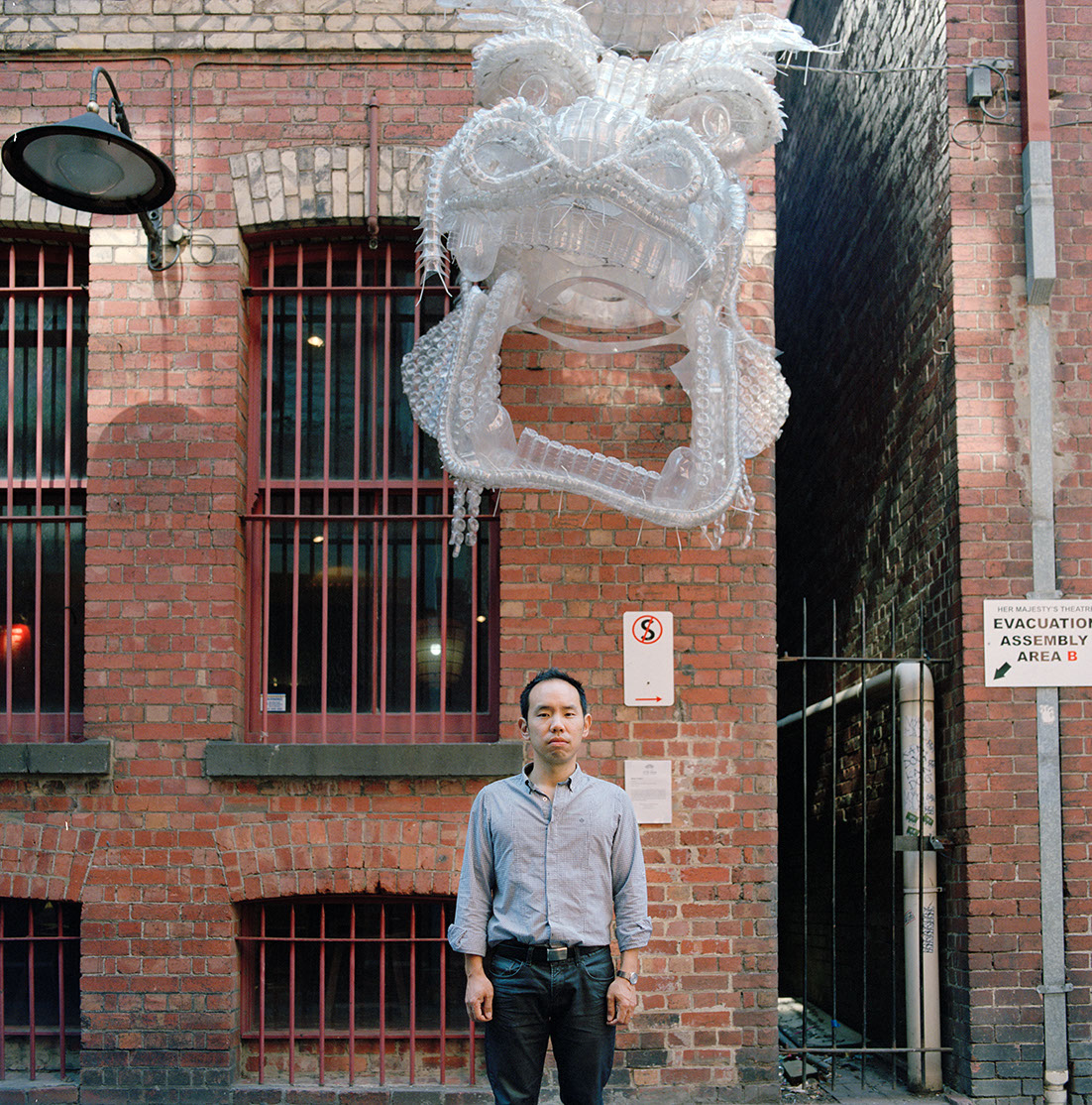
Craig Tan shot by Lee Grant

Naomi Ota shot by Lee Grant

There was once the idea for a restaurant at NewActon that never eventuated. But the story is such a nice one that I’m still going to tell it.

What was nice about it? A) It was being designed by Craig Tan who is a really special architect. B) Craig had enlisted textile artist Naomi Ota to co-create the space.

Craig’s idea for the restaurant was to create a sequence of small spaces and experiences that have different qualities so that people can find the one that suits them best. He wanted to give each space richness and depth without being too prescriptive. What he was looking for was a materiality that would give a different acoustic, tactile or visual sense so as to give a different feel to each space.

This is where the idea of using ropes came in. They offer all these things as well as the possibility of playing with light and shadows and really giving each space its own sensibility. And enter Naomi Ota.
Naomi is an installation artist who uses fabrics and fibrous materials to make a range of works from small detailed pieces to large spatially interactive designs.
Unusually, for a textile artist, Naomi is interested in interaction and negative space. She is all about interdisciplinary collaboration working on performance projects with the likes of dancer Tony Yap and musicians Tim Humphrey and Madeline Flynn. She judges her recent works on their capacity to invite other elements such as movement and sound into them. It’s a pretty perfect conceptualisation for a restaurant. It is this thinking that landed her the would be gig. Her technical knowledge of fibre and knots and her beautiful, organic aesthetic also doesn’t hurt.

To really get the sentiment behind Naomi’s works, I think you need to know about the Japanese concepts of “hare” and “ke”. The hare experience (or hare day) is a special day for rituals where everyone is free to celebrate and join in – it’s the extraordinary. Ke is an everyday day, the mundane, where you haul yourself around and things don’t work out. Naomi’s works strive for the hare. She loves the moment in her performance installation work when “something happens” the elements and the audience interact and create a special moment that is different every time.

Amazingly, though they come from different disciplines, cultures and experiences, Naomi and Craig’s take on how to make a space a place for introspection and experience was very similar. Really, they were looking to turn ke into hare – striving to make the extraordinary within an ordinary setting.

Permalink, Share on Twitter or

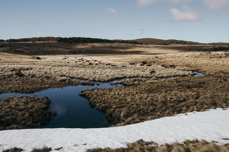
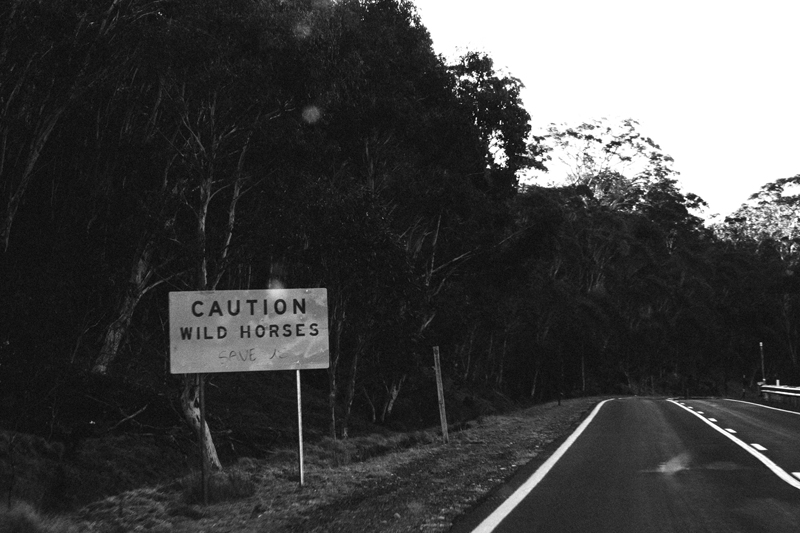
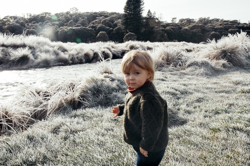
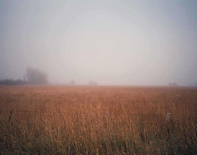
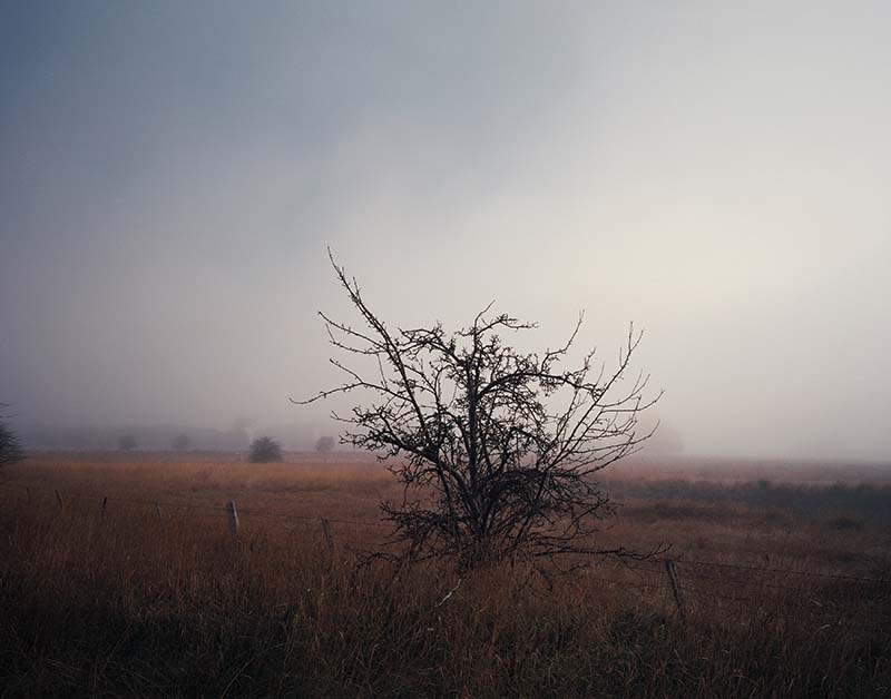
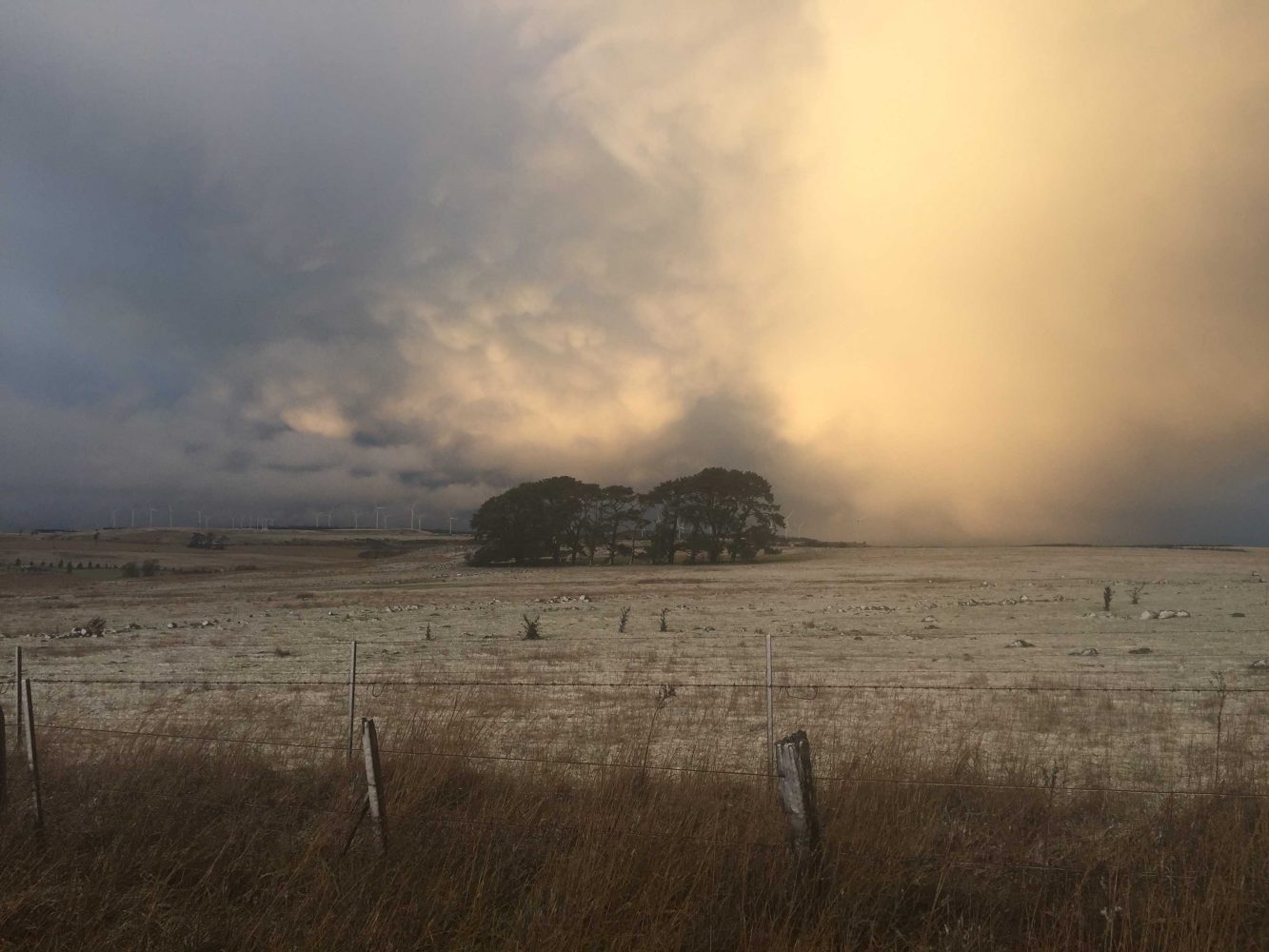
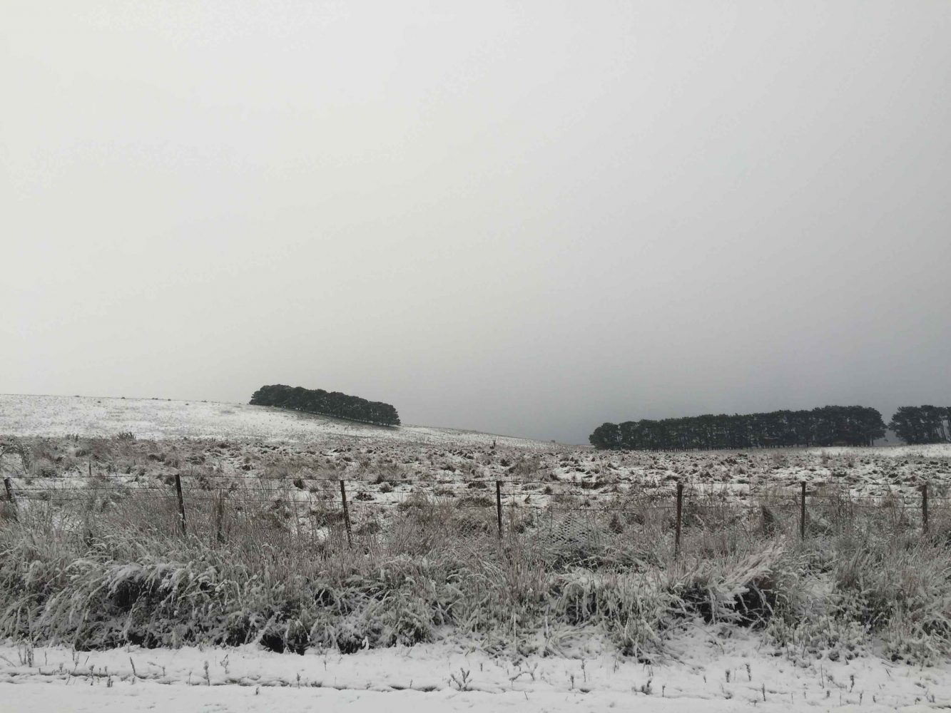
The Backroads to Canberra

Geography is just physics slowed down, with a couple of trees stuck in it.
— Terry Pratchett

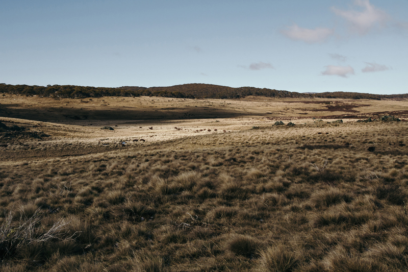
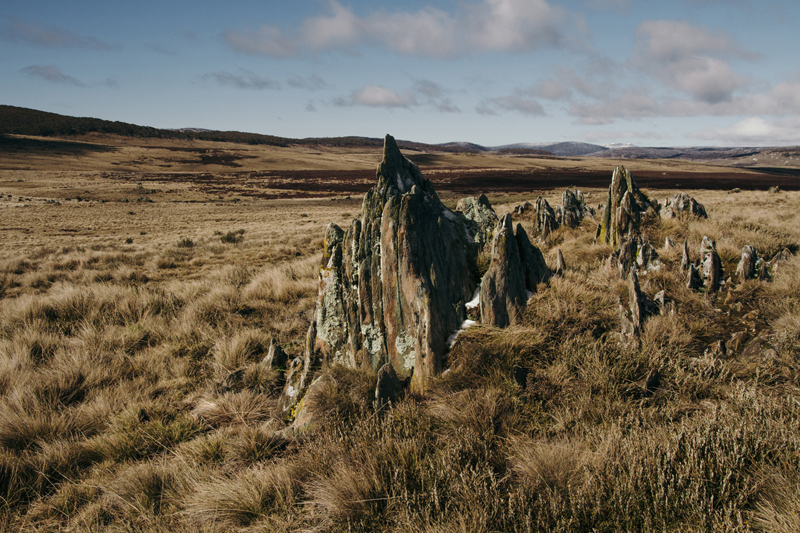
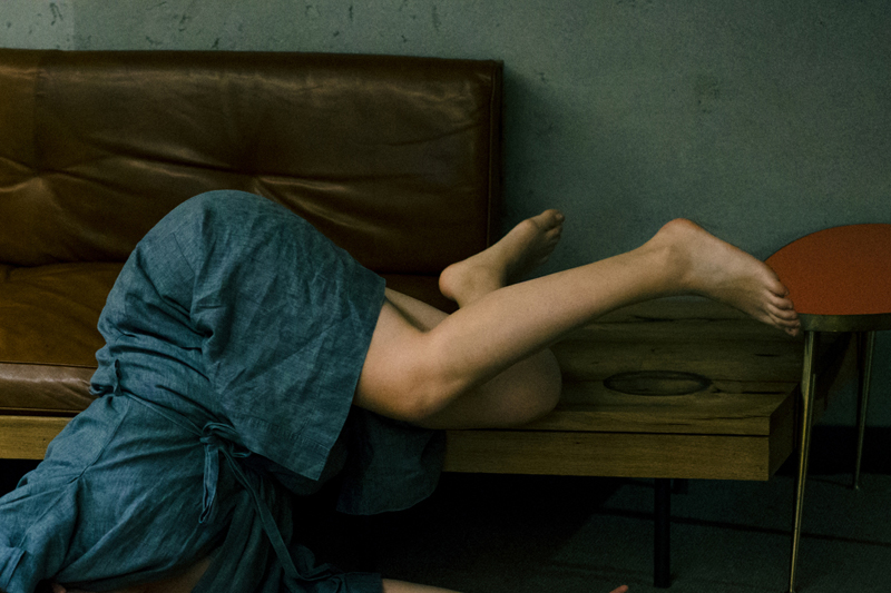
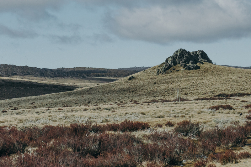
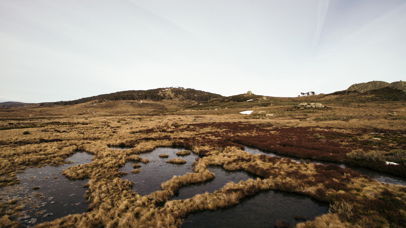
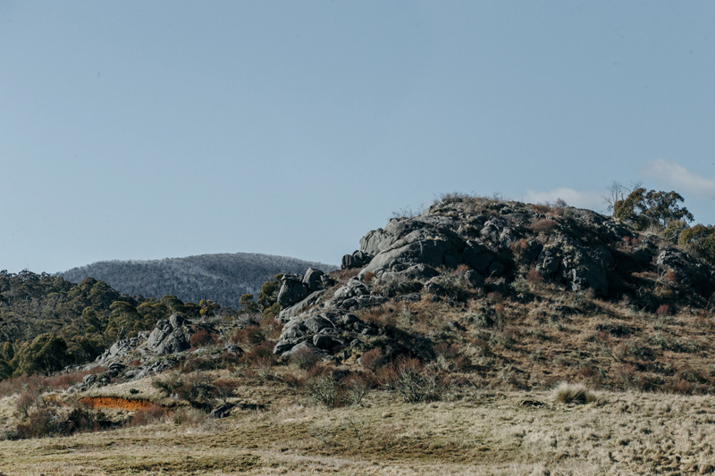
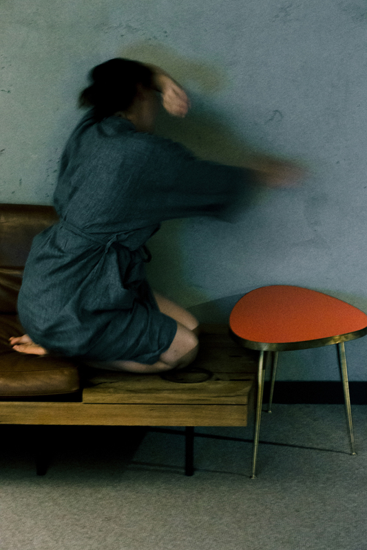
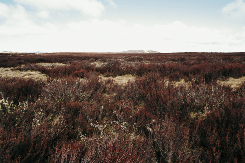
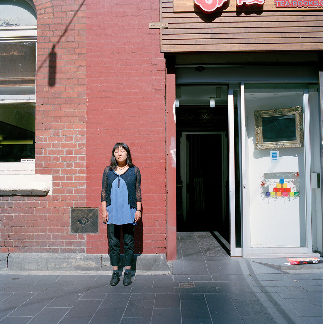
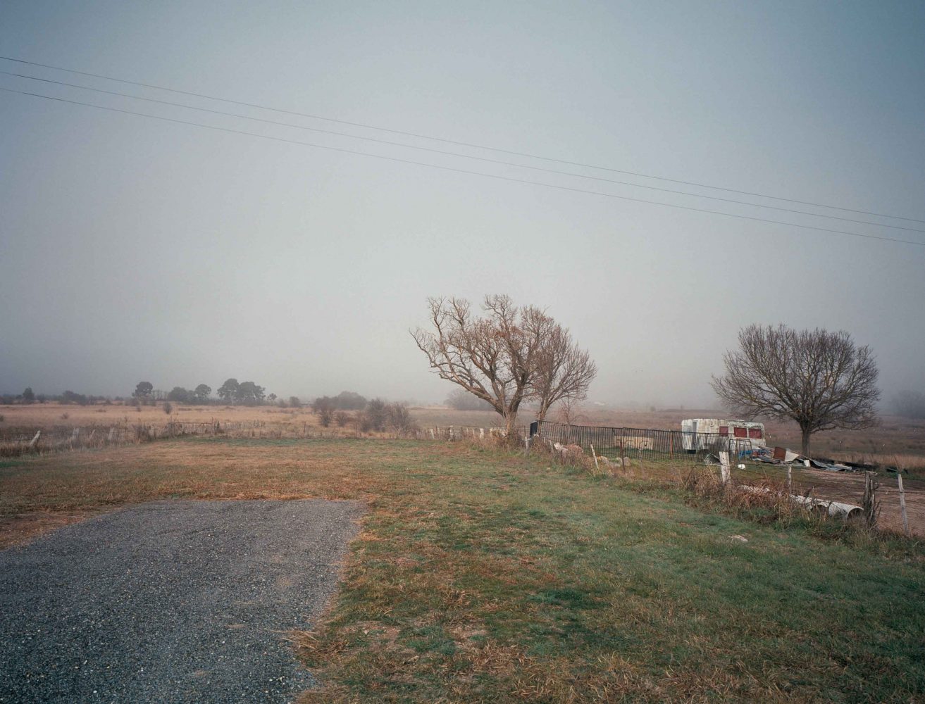
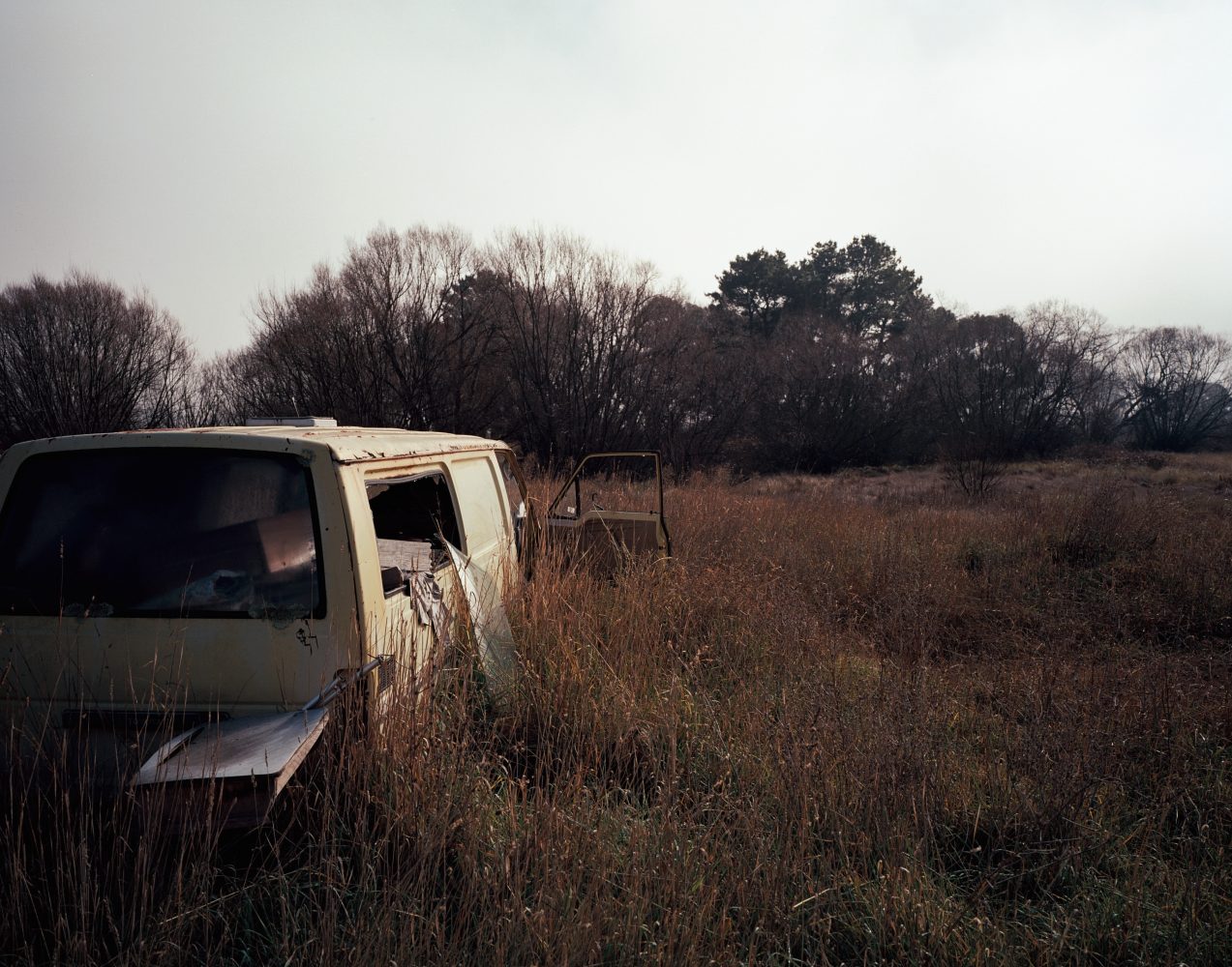
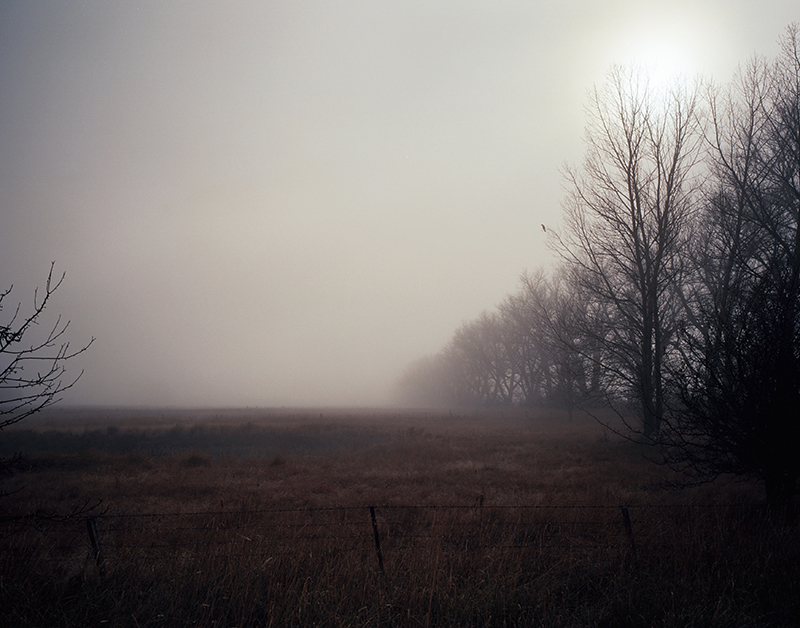
Images by Axel Moline of 'Love Want'.

Permalink, Share on Twitter or

Subscribe to news